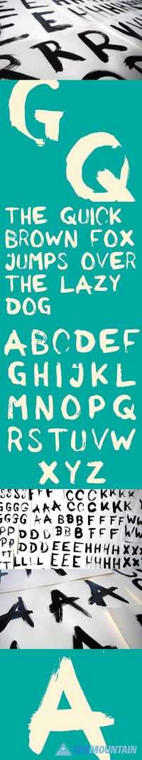
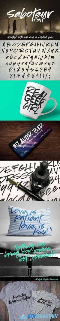
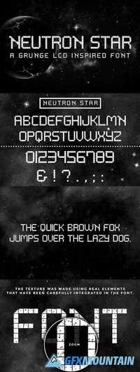
Saboteur a moody inky font 1545623
OTF TTF | 337 Kb
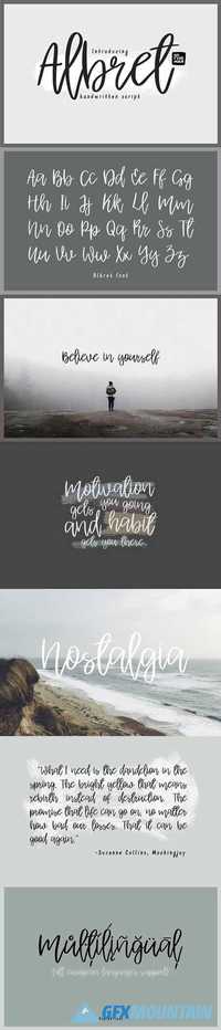
Introducing Saboteur! I went old-school with this font, creating the letters with ink and paper. I used a folded pen, which is one of my favorite lettering tools.
Despite being a true ink-brush font, Saboteur is still craft-friendly! The letters are all solid -- no internal areas to weed out. And the edges have been smoothed and refined just enough to make the letters easy to cut out, while still retaining some of their original rough character. (I've done a test cut on a Silhouette Cameo at one inch tall, and it both cut and weeded beautifully.)
As with all of my fonts, this one comes with plenty of punctuation and accented characters. And if there's an accented character missing, please don't hesitate to let me know what you need me to add!