Comenia Serif Pro Font Family

Comenia Serif Pro Font Family

Comenia Serif Pro Font Family
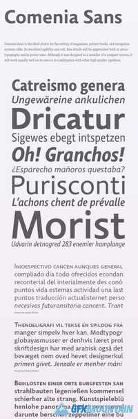
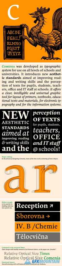
Comenia was developed as typographic system (Comenia Sans, Comenia Script) for use on all levels of schools and universities. It introduces new aesthetic standards aimed at improving reading and writing skills and the perception of texts for pupils, students, teachers, office and IT staff at schools. It offers a clear, intelligible and universal graphic tool for layout of primers, textbooks, educational texts and materials, for electronic typography and for the information systems.
Read more

Comenia Sans Font Family

Comenia Sans Font Family

Comenia Sans Font Family
Comenia Sans was designed in the framework of a unique typographic project for all types of schools. It is a complementary face for Comenia Serif, released by our friends at Storm Type Foundry. Comenia Sans has a lot in common with its serif sister: the height of both upper and lower case, the length of ascenders and descenders, and the general weight. This makes the two perfect partners which work well even when set side by side in a single line of text. Comenia Sans does, however, lack all serifs, ornamental elements and stroke stress variation. All these elements freshen up the feel of long texts, but for shorter texts use, they are not necessary. Despite that, Comenia Sans retains the soft, friendly character of its big sister, as well as a few tiny details which lend it its unique character without compromising legibility or utility.
Read more

Chiswick Sans Poster Font Family

Chiswick Sans Poster Font Family

Chiswick Sans Poster Font Family
Innovation in lettering almost always preceded the same innovation in typefounding. The sans serif letterform began to gain favor in the eighteenth century in areas of Britain long before its first appearance in Caslon’s specimen books. The higher contrasted variants, almost a modern serif form with the serifs removed appeared in the latter quarter of the 18th century and appeared in pockets of the country until Figgins pioneered them in type in the middle of the following century. The innovation of an italic has been added, making Chiswick Sans Poster an elegant and refined display face in a wide range of weights.
Read more

Genre Font Family

Genre Font Family

Genre Font Family

Genre is inspired by 19th century architecture, with serifs formed like facade ledges. Its nature is silent, stable and rational with distinctive fragile look. It’s been released in display cuts only, and the narrow proportions suggest its use for exhibition posters, magazine headlines and catalogues. This typeface is my juvenile schoolwork dated from 1988. The whole Regular set was drawn with ink on paper and photo-reproduced by magnifier in a darkroom. I used to set text lines on photographic paper for my early designs. Its naive concept and elaboration is obvious, but perhaps it may be found interesting. The official terseness and grey of Neo-Classical type faces will stand out when we narrow them. The consistently vertical shading of the letters suppresses one’s desire for eccentricity. Genre’s basic design is fairly light in colour, which is why it looks good in illustrated magazines and short texts and directly calls for graphically striking, contrasting headings.
Read more

Excelsor Script Font Family

Excelsor Script Font Family

Excelsor Script Font Family
Excelsor Script is inspired by lithographically produced scripts. It is softer and simpler than, for example, engraved Splendid Script, because its designer used pens and lithographic needles. The graver for steel is held in a quite different way and this has an influence on the shape of the letter. Similar type faces were in use from Neo-Classicism until the beginning of Art Nouveau, when they were pushed aside by a completely different view of festive typography. It has, in contradistinction to other scripts, slightly narrowed letters, which signifies a distinctive elegance without wasting space on the line. For practical reasons it was not possible to encircle the bottle with too long a label. It is, therefore, a suitable type face for labels.
Read more

Anselm Serif Font Family

Anselm Serif Font Family

Anselm Serif Font Family
The ancestry of Anselm goes back to Jannon, a slightly modified Old Style Roman. I drew Serapion back in 1997, so its spirit is youthful, a bit frisky, and it is charmed by romantic, playful details. Anselm succeeds it after ten years of evolution, it is a sober, reliable labourer, immune to all excentricities. The most significant difference between Sebastian/Serapion and Anselm is the raised x-height of lowercase, which makes it ideal for applications in extensive texts. Our goal was to create an all-round type family, equally suitable for poetry, magazines, books, posters, and information systems.
Read more

Adventura Speedol 68668

Adventura Speedol 68668

Adventura Speedol 68668
Adventura Speedol Handmade typeface inspired by permanent marker strokes. Simple, bold and casual shape strokes make this typeface easy to read event for bunch of text. This can be useful for title, quotes, label, etc. Simple but can be playful, including catchwords can gives more personal touch to your design. File info: Adventura Speedol, Adventura Speedol Outline, Adventura Speedol Stripes + Catchwords (otf & ttf) Thanks for your visit. Hope you enjoy.
Read more