Chiswick Poster Font Family

Chiswick Poster Font Family

Chiswick Poster Font Family
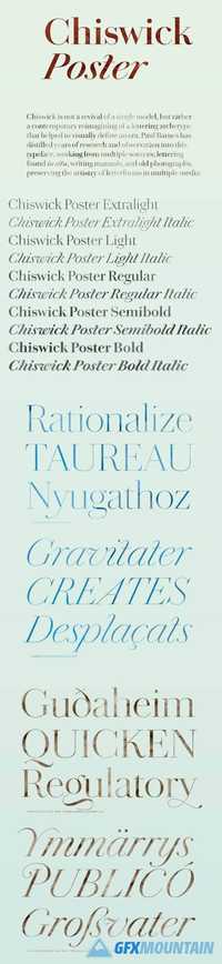
Chiswick Poster is designed for the largest sizes, of 80 point and above, for headlines in magazines, for posters, for shop signs, or anywhere else a seriffed letter with distinction and refinement is needed. An early version of Chiswick served as the primary display typeface in the 2010 redesign of O, The Oprah Magazine by Robert Priest and Grace Lee, where its beautiful forms, particularly in the Poster size, gave a breezy opulence to feature openers and section heads. The character set has been greatly expanded; small capitals, a variety of figures, and many alternates, swash forms, and other typographic details are included in all sizes.
Read more

Chiswick Sans Poster Font Family

Chiswick Sans Poster Font Family

Chiswick Sans Poster Font Family
Innovation in lettering almost always preceded the same innovation in typefounding. The sans serif letterform began to gain favor in the eighteenth century in areas of Britain long before its first appearance in Caslon’s specimen books. The higher contrasted variants, almost a modern serif form with the serifs removed appeared in the latter quarter of the 18th century and appeared in pockets of the country until Figgins pioneered them in type in the middle of the following century. The innovation of an italic has been added, making Chiswick Sans Poster an elegant and refined display face in a wide range of weights.
Read more

Chiswick Sans Font Family

Chiswick Sans Font Family

Chiswick Sans Font Family

Chiswick Sans demonstrates that the past can offer inspiration for new typefaces which are not slavishly historical. The high contrast sans serif offers a letterform that shares the unadorned simplicity of a low contrast sans, but also shares the beauty of a serif letter.
Read more

Chiswick Headline Font Family

Chiswick Headline Font Family

Chiswick Headline Font Family

Chiswick follows the path taken by John Baskerville (1706–1775) in taking the handmade letter and fixing it in type. The single surviving example of Baskerville’s lettering, cut in the 1730s, shows the vernacular letter that would be the model for his later adventure in printing. As a modern serif design, Chiswick has high contrast between thick and thin, yet its freewheeling shapes make it quite distinct from other members of the genre, such as Didot, Bodoni or a Scotch Roman. At the same time, its crisp contrast makes it different from a transitional design such as Baskerville or the types cut by Richard Austin for John Bell, which are more formal in style. Chiswick Headline is designed for situations where Chiswick Poster is too delicate and Chiswick Deck too heavy in its thins and serifs; perfect for sizes from 30 point to 60 point.
Read more