Jironis is an awesome looking app landing one page React Next Template. It is specially designed for any kind of mobile app, software, sass, startup, marketing, one page and other online businesses.
Features Includes 2 Home versions Includes 2 Inner pages Built with React JS Built With Next JS Used React Hooks No Class Component No jQuery Dependency No Console Errors Reusable Components
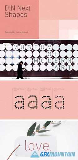
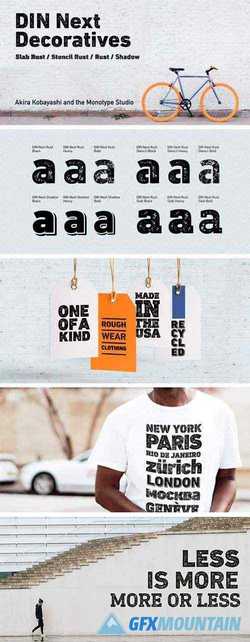
DIN Next Shapes Font Family Sabina Chipara?'s DIN Next Shapes typeface is a twist on the original German industrial classic, taking its skeleton and re-clothing it in dots, hearts, snowflakes and stars. The design offers a more approachable and whimsical tone of voice than the original, while maintaining all the legibility and clarity of form that makes DIN Next such a reliable and versatile design. It works in harmony with DIN Next, and is particularly suited for designers looking to be a little more expressive.
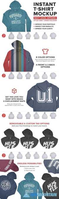
NEXT LEVEL 9300 PULLOVER MOCKUPS 2042776 PSD | 157 MB These Next Level Apparel 9300 PCH Pullover Hoodie Mockups breathe life into your design work. Whether you’re designing t-shirts for a client or mocking up your next product, this is a must-have resource. Best of all, these mockups are accurate and easy to use!
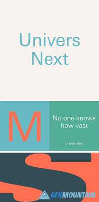
Univers Next is a completely reworked version of the original Univers typeface family by Adrian Frutiger. Based on a student project he drew in the late 1940s, Frutiger completed the Univers family in 1957 for Deberny and Peignot, where he was a staff designer. As the first large type family to be conceived in a wide range of widths and weights right from its inception, with a unique systemized numbering system, Univers was truly a trailblazer. In 1997 Adrian Frutiger and the design staff at Linotype completed the large joint project that resulted in Linotype Univers, a cohesive font family of 63 weights. The existing weights were completely redrawn, making the proportions more consistent and improving fine details such as curves and thick-to-thin stroke ratios. By following Frutiger’s original designs, Univers’s humanist characteristics were underlined.
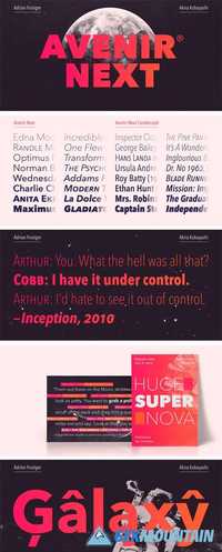
Avenir Next Pro is a new take on a classic face—it’s the result of a project whose goal was to take a beautifully designed sans and update it so that its technical standards surpass the status quo, leaving us with a truly superior sans family. This family is not only an update though, in fact it is the expansion of the original concept that takes the Avenir Next design to the next level. In addition to the standard styles ranging from ultra light to heavy, this 32-font collection offers condensed faces that rival any other sans on the market in on and off—screen readability at any size alongside heavy weights that would make excellent display faces in their own right and have the ability to pair well with so many contemporary serif body types. Overall, the family’s design is clean, straightforward and works brilliantly for blocks of copy and headlines alike. Akira Kobayashi worked alongside Avenir’s esteemed creator Adrian Frutiger to bring Avenir Next Pro to life. It was Akira’s ability to bring his own finesse and ideas for expansion into the project while remaining true to Frutiger’s original intent, that makes this not just a modern typeface, but one ahead of its time.
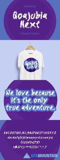
Goajubia Next Typeface 1437712 TTF OTF Goajubia Next is a fresh & modern font. Goajubia Next is perfectly suited to stationery, logos, t-shirt, paper, print design, website header, photo frame, flyer, music cover, poster, image slider and much more.
![Jironis v1.0 - React Next App Landing Page Template [themeforest, 28023877]](/uploads/posts/2020-10/1601740377_jironis-v1_0-react-next-app-landing-page-template-themeforest-28023877.jpg)