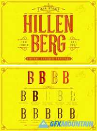
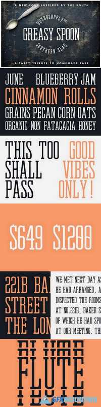
Hillenberg+Extras 1781569
Hillenberg have 10 Style : Regular, Extrude, Extra Inline, Extra Shadow, Outline, Shadow, Inline, Inline Shadow, Pres, Press Shadow with vintage serif character inspired from beer and brewery. You can mix and match the layered font and Extras Ornament, its very helpfull to get Vintage design. Suitable and applicable to create vintage design, branding, logos, product packaging, invitation, qoutes, t-shirt, label poster etc.