Contaur Typeface 2030703
Contaur Typeface 2030703
OTF TTF Web
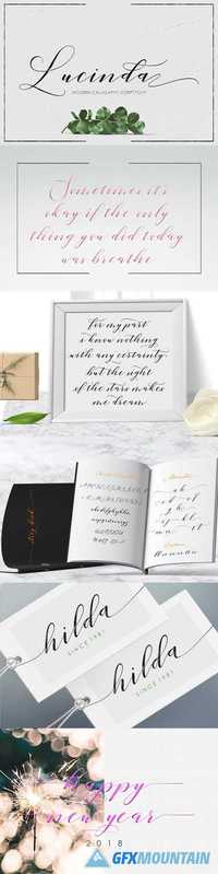
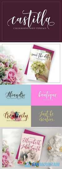
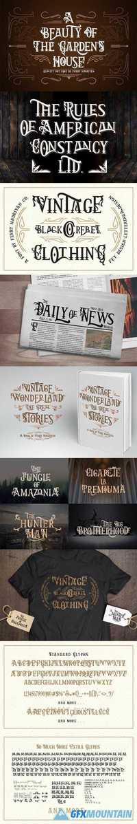
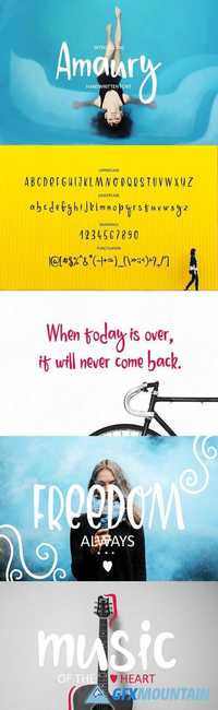
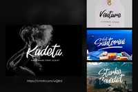
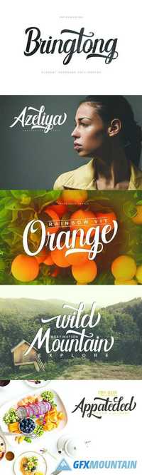
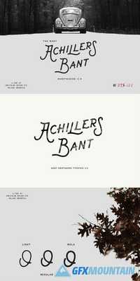
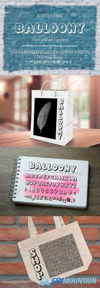
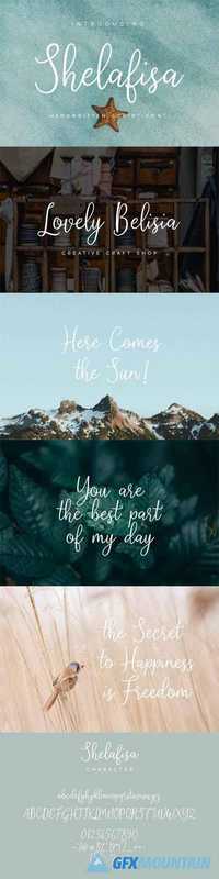
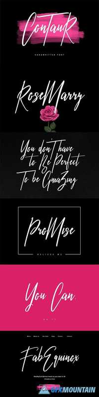
Give your designs an authentic handcrafted feel. "Contaur" is perfectly suited to signature, stationery, logo, typography quotes, magazine or book cover, website header, clothing, branding, packaging design and more.
OTF TTF Web
Give your designs an authentic handcrafted feel. "Contaur" is perfectly suited to signature, stationery, logo, typography quotes, magazine or book cover, website header, clothing, branding, packaging design and more.