Hey Betty 1375004
OTF | TTF | RAR 159 KB
OTF | TTF | RAR 159 KB
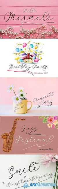
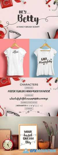
Hey Betty is a wonderful Brush Font, designed to give that ultra-modern feel. Perfect for T Shirt Designs, Display Art and Card Invites, Hey Betty certainly brings something extra to your design work.