Round Compound 1722769
Round Compound 1722769
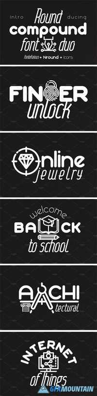
Hi, friends. Introducing font couple - Round compound. This font duo helps to create you best logos, badges, headlines and captions.
Hi, friends. Introducing font couple - Round compound. This font duo helps to create you best logos, badges, headlines and captions.