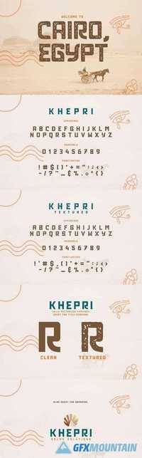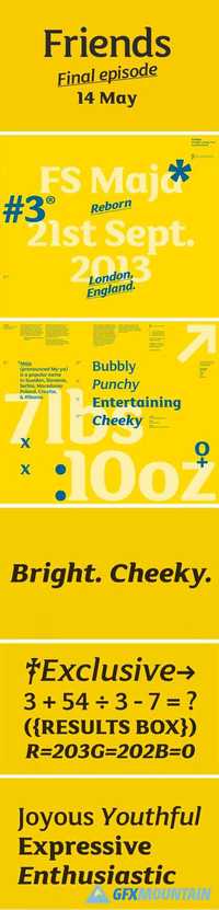
Little Ninja Font 1596104
4 OTF 4 WOFF 4 EOT
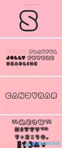
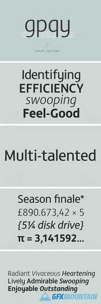
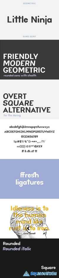
Little Ninja comes in the regular rounded version with italics as well as a sharper, square version with italics - perfect for when you need a little extra punch!
4 OTF 4 WOFF 4 EOT
Little Ninja comes in the regular rounded version with italics as well as a sharper, square version with italics - perfect for when you need a little extra punch!