Charleston | Font Duo + Bonus Floral 1527840
Charleston | Font Duo + Bonus Floral 1527840
2 OTF 2 TTF EPS PNG
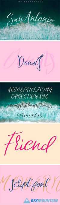
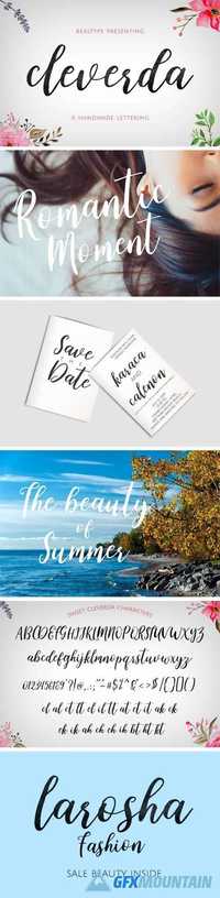
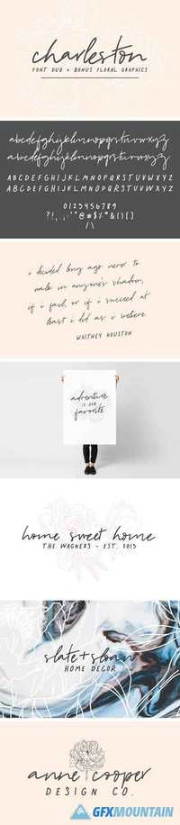
Charleston is a beautiful font duo that is perfect for informal, messy design. I love this pair for invitations, logo design, quotes, and content creation (helloooooo Instagram!). It also includes three beautiful floral graphics to add to your logos, backgrounds, or use by themselves! Charleston Script is a gorgeous all-lowercase script that has stylistic alternates available via the uppercase letters. Charleston Regular is casual all-caps sans serif that has stylistic alternates available via the lowercase letters.
2 OTF 2 TTF EPS PNG
Charleston is a beautiful font duo that is perfect for informal, messy design. I love this pair for invitations, logo design, quotes, and content creation (helloooooo Instagram!). It also includes three beautiful floral graphics to add to your logos, backgrounds, or use by themselves! Charleston Script is a gorgeous all-lowercase script that has stylistic alternates available via the uppercase letters. Charleston Regular is casual all-caps sans serif that has stylistic alternates available via the lowercase letters.