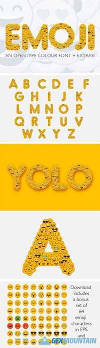
EMOJI FONT They say that a picture tells 1000 words, now you can use words and pictures to say just what you want. EMOJI is a fun font created using multiple emoji character faces. Perfect for bold headers, banners and posters. BONUS EXTRAS The download also includes a set of 64 emoji characters in two formats, as an EPS 10 file and as a 3000x3000 pixel jpg. They are perfect for blog posts and social media profile! The font is a colour OpenType file which means this font will show up only in apps that are compatible with color bitmap fonts, like Adobe Photoshop CC 2017.0.1 It comes as a special OpenType .otf font file, in which each character is encoded with two image formats: OpenType-SVG and SBIX.
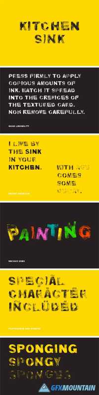
This typeface is named after the favourite haunt of the sponges which were used to create it - the kitchen sink. A shaped sponge was covered in acrylic paint, dabbed onto paper plenty of times, and then scanned in order to create each letter.
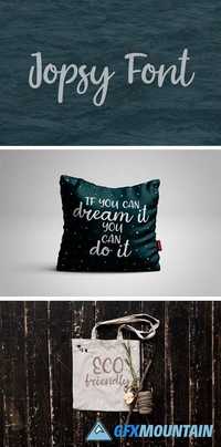
Hello! Jopsy is casual handwritten font that is suitable for design awesome greeting cards, posters, branding materials, logo, invitations, overlays, quotes, and any other interesting projects.
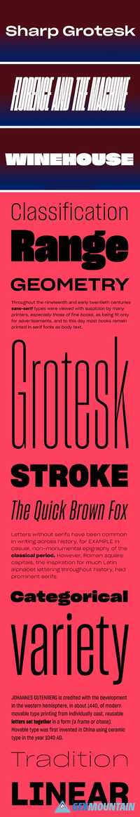
Swiss styling collides with the unexpected construction and wonky imperfectionism of 20th century American woodtype in Lucas Sharp’s monument to Adrian Frutiger: Sharp Grotesk. With its exuberant personality, ink traps, and incredible range of moods, Sharp Grotesk is a brand new and uniquely American perspective on the genre of the multi-width neo-grotesk. Originally beginning as hand drawn poster lettering in 2011, Sharp Grotesk eventually grew to encompass a massive range of 21 widths in 7 weights of roman & italic, for a total of 259 fonts.
This preset adds a light tone for your summer photos. Delicate and light colors emphasize the beauty of wedding dresses and soft decor! These Lightroom presets will give your photos looks that range from soft and painterly to vibrant and detailed. Each preset has been crafted to look great with a wide variety of images. Fully adjustable. These preset are compatible with RAWs in Adobe Lightroom 4 & 5! Not compatible with Photoshop or Photoshop Elements.