Corporate Social Media Cover 1654243

Corporate Social Media Cover 1654243

Corporate Social Media Cover 1654243
PSD | 1 MB RAR

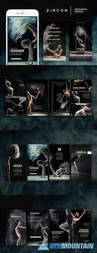
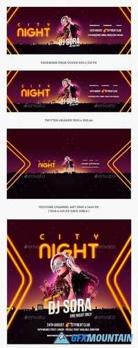
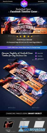
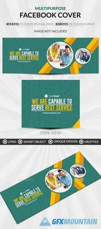
A one of a kind presentation for your Social Media Marketing! You can add your own/company’s information & work to your timeline as well as other social media. All resources are layered so you can also use them on your website or blog. This pack features Facebook, Twitter, Google+, Youtube & Linked In covers, including a layered resource kit which you can use to create your own timeline cover, to customize the pre made designs to create something unique ! or just use the cover designs as you want.
Read more

Avenir Next Pro Full Family

Avenir Next Pro Full Family

Avenir Next Pro Full Family

Avenir Next Pro is a new take on a classic face—it’s the result of a project whose goal was to take a beautifully designed sans and update it so that its technical standards surpass the status quo, leaving us with a truly superior sans family. This family is not only an update though, in fact it is the expansion of the original concept that takes the Avenir Next design to the next level. In addition to the standard styles ranging from ultra light to heavy, this 32-font collection offers condensed faces that rival any other sans on the market in on and off—screen readability at any size alongside heavy weights that would make excellent display faces in their own right and have the ability to pair well with so many contemporary serif body types. Overall, the family’s design is clean, straightforward and works brilliantly for blocks of copy and headlines alike. Akira Kobayashi worked alongside Avenir’s esteemed creator Adrian Frutiger to bring Avenir Next Pro to life. It was Akira’s ability to bring his own finesse and ideas for expansion into the project while remaining true to Frutiger’s original intent, that makes this not just a modern typeface, but one ahead of its time.
Read more

Retiro Font Family

Retiro Font Family

Retiro Font Family

Retiro is a daring interpretation of Spanish typography. Severe, austere and yet, full of life, Retiro is a vernacular version of Castilian and Andalusian in a typical Didot. Named after a lovely park in Madrid, Retiro started life as a a bespoke typeface designed to give a unique voice to the magazine Madriz. In 2006, the founder of Madriz was looking for a Didot for his new magazine. The Didot is the archetypal typeface used in high-end magazines. Retiro, based on Ambroise is a synthesis of these high contrast styles mixed with an Hispanic mind. Result is then, after 2-3 years of work, a typeface with countless variations – Retiro in 2009 included 470 glyphs – to establish typographic shades adapted to different sections and pages of the Madriz.
Read more

Scania Sans Font Family

Scania Sans Font Family

Scania Sans Font Family

With the aim to be the leader in sustainable transport, Scania builds its business while creating value for customers, employees and society. Delivering customised heavy trucks, buses, engines and services, focus is always on efficient, low-carbon solutions that enhance customer profitability. With design direction by Brand Union Stockholm we have developed a wide type family with 8 styles and updated the classic word mark.
Read more

Pally Font Family

Pally Font Family

Pally Font Family

Pally is a highly-informal sans serif design. Its three weights were designed by Jean-Baptiste Morizot. Pally’s letterforms are all a bit wobbly; the angles of many letters’ strokes are atypical – just look at the capital ‘A’ – and the left and right-hand-sides of many letters are not the same size or height (e.g., the lowercase ‘a’ and ‘n’). As a result, Pally has a lot more character than most sans serif typefaces. It could be an excellent choice for headlines or signage in children’s services projects, like family centers, pediatricians’ offices, primary schools, etc. Once you begin to understand the different rhythm that Pally offers, its underlying typographic sophistication becomes clear. The ascenders of the lowercase letters, rise above the heights of capital letters and numerals. The lowercase alphabet includes a double-storey ‘a’, a single-storey ‘g’, and a Jensonian ‘e’, with a diagonal stroke in its middle-section. Each Pally weight has been drawn in a more-or-less monolinear fashion. In the fonts’ extended character sets, there is plenty of space between each letter and diacritics that come on top of it.
Read more

Author Font Family

Author Font Family

Author Font Family

Author is a family of humanist sans serif fonts. They are optimised for use in modern publications – hence the the name ‘Author.’ Its letterforms are slightly expanded, which gives the counterforms inside of them enough space to breathe, thus increasing their legibility and helps with their on-screen rendering, too. Author’s family includes six weights, ranging from Extralight through Bold. Each weight has an upright and an italic font on offer. The uppercase letters are virtually monolinear in appearance; however, several of the lowercase letters have visible stroke contrast. The tops of Author’s strokes terminate in diagonal cuts; these are reminiscent of the broad-pen that would be used to write the humanist letterforms the typeface is based on. In Author’s upright fonts, the lowercase ‘a’ and ‘g’ are double-storied; there is a single-storey ‘g’ in the fonts as an OpenType alternate. In the italic fonts, the ‘a’ and the ‘g’ are both single-storied. The ascenders of Author’s lowercase letters a slightly taller than the tops of the capitals. The family’s fonts include both lining and oldstyle figures; in both versions, the ‘3’ has a flat top. Author comes from Satya Rajpurohit, the founder of Fontstore.
Read more