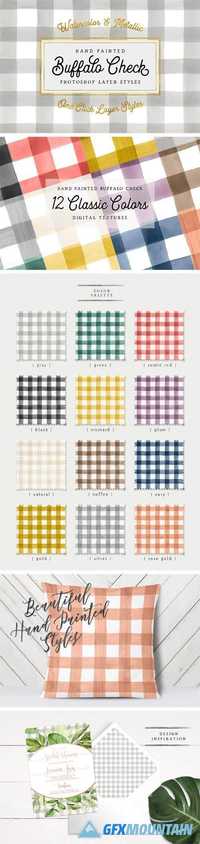
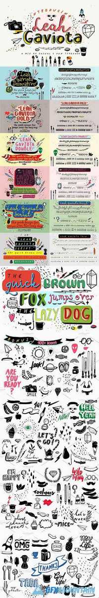
Deutschmeister Font

Deutschmeister Font

Deutschmeister Font

This crisp and constructed Ludwig Wagner, Leipzig, blackletter font in textura style had been originally designed by Berthold Wolpe. Freshly redrawn and redesigned, it adds now to the treasure trove of historic typefaces. This font contains a bunch of useful ligatures, and by typing ‘N’, ‘r’ and period plus activating the discretionary ligatures you get an oldstyle numbersign. As usual in my blackletter fonts, the # key is occupied by the ‘round’ s.
Read more

Jean Paul Fraktur Font Family

Jean Paul Fraktur Font Family

Jean Paul Fraktur Font Family

A typographic treasure, originated in the Biedermeier epoch at the beginning of the 19th century, had been brought back to life. With its charming touch it makes a wonderful font for reprints and historically relevant projects.This font contains a bunch of useful ligatures, and by typing 'N', 'r' and period plus activating the discretionary ligatures you get an old style number sign. As usual in my blackletter fonts, the # key is occupied by the 'round' s.
Read more

Market Sans Font Family

Market Sans Font Family

Market Sans Font Family

We worked with the eBay brand team and the New York based design agency Form&. Market Sans’ style came from the Capital typeface, a font from our Lab department. eBay bought the exclusive rights for developing a complete font family and taking it out of the market. This typeface was a fusion between the neo-grotesque style of the Suisse Int’l and the geometric shapes of the Euclid Flex typeface. Market Sans is a brand-new family including six weights with italics.
Read more

Canoe Handwriting Font

Canoe Handwriting Font

Canoe Handwriting Font

Canoe is a fun, all-caps font with a delightfully hand-written feel. It comes “water ready” to be used in the wild on the web, save the dates, and other design projects that need a homemade touch. Its characters are wiry and tall with crossbars that hit at varying heights. Canoe also includes 1st, 2nd, 3rd ordinal capabilities as well as fractions.
Read more

Fairfield Font Family

Fairfield Font Family

Fairfield Font Family

Fairfield is a fifty-year-old typeface that has had a recent facelift. Rudolph Ruzicka, artist and book illustrator, designed light and medium weights of Fairfield for Linotype in 1940 and 1949, respectively. For Fairfield’s 1991 release as an electronic typeface, designer Alex Kaczun added bold and heavy weights. With its straight, unbracketed serifs and abrupt contrast between thin and thick strokes, Fairfield harks back to the modern typefaces of Bodoni and Didot, but has a distinctly twentieth-century look. Fairfield is a fine text face, both for books and shorter texts. Kaczun added small capitals and old style figures, swash capitals, and a set of “caption” typefaces (sloped roman style) that were inspired by Matthew Carter's extensions to Oldstyle 7 for National Geographic magazine.
Read more

Montecatini Font

Montecatini Font

Montecatini Font

Montecatini takes its cues from the elegant Stile Liberty travel posters of Italy in the early 1900s. The font features distinctive ligatures typical of the time when Art Nouveau emerged as a worldwide phenomenon. Everything looks better in Montecatini, from book jackets to monograms to packaging and logos—and the wide selection of ligatures make copyfitting a delight.
Read more