URW Antiqua Font Family

URW Antiqua Font Family

URW Antiqua Font Family
63 OTF
URW Grotesk was designed exclusively for URW by Prof. Hermann Zapf in 1985. At the same time, Zapf designed URW Antiqua to go with URW Grotesk. At that time, we were working with a large German publishing house (Axel Springer) on type design solutions to replace certain of their newspaper fonts. Test pages of large German newspapers (e.g. Bildzeitung) were printed with URW Grotesk and URW Antiqua font families. For reasons not disclosed to us, the project was dropped and Springer never used URW Grotesk and URW Antiqua for that purpose.
Read more

Uncial Antiqua Pro Font Family

Uncial Antiqua Pro Font Family

Uncial Antiqua Pro Font Family
OTF TTF
Our Uncial Antiqua Pro is a hybrid typeface which combines the speedier penned styles of Uncial and Half Uncial letterforms together in a formal text representation. Signature letterforms to the Uncial & Half Uncial styles are not sacrificed in this compilation, yet readability is surprisingly maintained when read in context. The SmallCaps and extensive figure sets only further expand the range of usability and appeal.
Read more

Beatrix Antiqua Font Family

Beatrix Antiqua Font Family

Beatrix Antiqua Font Family
18 TTF
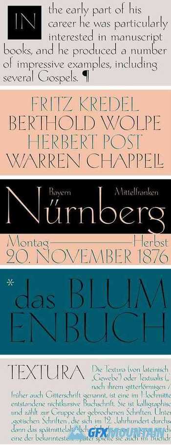
Beatrix Antiqua is a humanist sans-serif typeface designed by Francesco Canovaro. Beatrix Antiqua is part of the Beatrix Family that takes its inspiration from the classic Roman monumental capital model: its capitals are directly derived from the stone carvings in Florence Santa Croce Cathedral - where the serifs are often removed while keeping the variable width strokes. So, even if it’s basically a sans-serif, Beatrix keeps a subtle swelling at the terminals suggesting a glyphic serif - in the same vein as Herman Zapf classic Optima typeface. In the lowercase design, Beatrix references early humanist typefaces, keeping small calligraphic details (as the prolongation of the e nose) that are expecially visible in the italics. While Beatrix Antiqua, the companion typeface to Beatrix Nova, slightly exaggerates its antique stylistical features, Beatrix Nova tries to mix those influence with a more robust & digital age ready design, featuring bigger X-height and an extended character set that covers over forty languages using the latin alphabet, as whell as Greek and Russian Cyrillic.
Read more

Zapf Renaissance Antiqua SH

Zapf Renaissance Antiqua SH

Zapf Renaissance Antiqua SH
7 OTF
Since the release of these fonts most typefaces in the Scangraphic Type Collection appear in two versions. One is designed specifically for headline typesetting (SH: Scangraphic Headline Types) and one specifically for text typesetting (SB Scangraphic Bodytypes). The most obvious differentiation can be found in the spacing. That of the Bodytypes is adjusted for readability. That of the Headline Types is decidedly more narrow in order to do justice to the requirements of headline typesetting. The kerning tables, as well, have been individualized for each of these type varieties. In addition to the adjustment of spacing, there are also adjustments in the design. For the Bodytypes, fine spaces were created which prevented the smear effect on acute angles in small typesizes. For a number of Bodytypes, hairlines and serifs were thickened or the whole typeface was adjusted to meet the optical requirements for setting type in small sizes. For the German lower-case diacritical marks, all Headline Types complements contain alternative integrated accents which allow the compact setting of lower-case headlines.
Read more