Caponi Text Font Family
Caponi Text Font Family
10 OTF
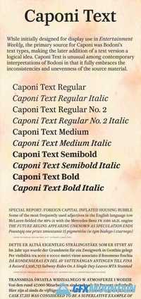
While Caponi was initially designed for display use in Entertainment Weekly, the primary source was Bodoni’s text types, making the later addition of a text version a logical idea. Caponi Text is unusual among contemporary interpretations of Bodoni not just in focusing on Bodoni’s earliest work, but also in fully embracing the inconsistencies and unevenness of the source material. The warm, inviting tone of Caponi Text expands the notion of how a Bodoni can feel on the page. While preserving many eccentricities, it also make concessions to contemporary taste, so a more traditional lowercase s, with serifs rather than ball terminals, is available as an alternate.
10 OTF
While Caponi was initially designed for display use in Entertainment Weekly, the primary source was Bodoni’s text types, making the later addition of a text version a logical idea. Caponi Text is unusual among contemporary interpretations of Bodoni not just in focusing on Bodoni’s earliest work, but also in fully embracing the inconsistencies and unevenness of the source material. The warm, inviting tone of Caponi Text expands the notion of how a Bodoni can feel on the page. While preserving many eccentricities, it also make concessions to contemporary taste, so a more traditional lowercase s, with serifs rather than ball terminals, is available as an alternate.