Damien Display Font Family

Damien Display Font Family

Damien Display Font Family

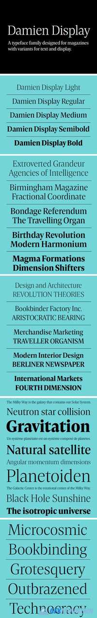
Damien is a contemporary serif typeface family especially designed for editorial typography. Thanks to its straightfoward forms with sharply cut details and pointy triangular serifs, it comes with great authority and vigor. This strictness is most evident in the Display styles, which are intended for headlines and other larger applications. They are characterized by a higher contrast, a tighter spacing and more compact shapes in comparison to the Text version. The five upright Display weights, ranging from Light to Bold, with stylistic alternates for diamond-shaped dots and punctuation, offer a variety of options for creating eye-catching typographic gestures. Damien Display consists of five upright styles and is available for desktop, app, e-book and web licensing.
Read more

Cenzo Flare Font Family

Cenzo Flare Font Family

Cenzo Flare Font Family
40 OTF
Cenzo Flare is a mixture of modern san serif base with a touch of flare to it. The inspiration is drawn from all kinds of old Americana advertising, Italian posters, old century logos and signs. All that plus the strong trend on retro fonts now displayed on tv series and current music imagery results on Cenzo Flare.
Read more

Organic Family 2008484

Organic Family 2008484

Organic Family 2008484
8 OTF 4 TTF
ORGANIC FAMILY FONT can make your design more stunning and more Awesome, a ORGANIC FAMILY FONT have 4 different style Reguler, Slab, Light, Stencil. Perfect for making design: Badges, posters, a variety of quotes, header, logo design, blog headers, all kinds of covers, T-shirts, mugs, etc.
Read more

Alte Schwabacher Font Family

Alte Schwabacher Font Family

Alte Schwabacher Font Family

Schwabacher was the predominantly used typeface in Germany from about 1470 until about 1530. Schwabacher has round character forms other than Textura or Fraktur. It spread rapidly through the popular poems by Hans Sachs but even more through the Reformation. All works by Luther and other reformers were printed in Schwabacher. Gutenberg still used Black Letter handwritings (Textura) for his printings, but these styles were replaced by the Schwabacher typeface under the influence of the renaissance towards the end of the 15th century. Reportedly, Schwabacher was first used by Johannes Bamler for an incunabulum in 1472.
Read more

URW Typewriter Font Family

URW Typewriter Font Family

URW Typewriter Font Family

Designed by URW Studio in 1994, URW Typewriter is a classic, full featured and well executed typewriter styled serif design. With 50 different styles in the complete family, URW Typewriter is one burl of a slab serif family that all design studios must have in their type collection.
Read more