FS Olivia Font Family

FS Olivia Font Family

FS Olivia Font Family

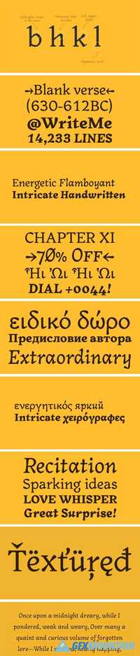
On a visit to Belgium and the Netherlands while still an MA student at Reading University, Eleni Beveratou made some important discoveries. First, there was the letter ‘g’ from the Didot family seen at Plantin Moretus Museum in Antwerp, which seemed “almost like a mistake”. Then there were strange details such as the serifs on the “l”, “h”, “k”, “b” ?and “d” in Egmont Cursive and other typefaces by Sjoerk Hendrik de Roos, found in volumes of poetry she picked up from a chaotic bookshop in Amsterdam. These were characters that stood out from the text but seemed to blend harmoniously with the rest ?of the letters. “And there it was, the spark. ?I decided to design a typeface that would capture the details of the process of writing.”
Read more

FS Albert Narrow Font Family

FS Albert Narrow Font Family

FS Albert Narrow Font Family

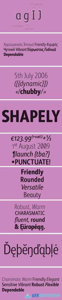
FS Albert Narrow is a narrow version of FS Albert Pro, designed by Jason Smith. But, drawn from scratch, it’s more like a font in its own right, as Jason Smith explains. “The challenge in designing a narrow version of a typeface based on an existing design is not to make it to look squashed. “There comes a point in condensing a font where it becomes broken. You can usually automatically squash something by 10% and it will still look OK. But by the time you’ve squashed it by 25% the type looks ugly and needs redrawing. So we drew it all manually in order to ensure the design integrity was kept while still fulfilling the need to save space.”
Read more

FS Clerkenwell Font Family

FS Clerkenwell Font Family

FS Clerkenwell Font Family

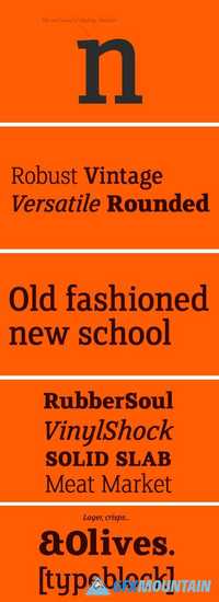
2003. Fontsmith was sharing a small, cold, whitewashed studio space in Northburgh Street, Clerkenwell. But things were on the up following prestigious custom type commissions for The Post Office and E4. “Slab serifs were on the brink of another revival, we could feel it,” says Jason Smith. “All we wanted to do was have a play with these slabs, go as far as we could within what was acceptable and readable.” “It wasn’t initially clear what was happening,” recalls Phil Garnham. “We were becoming very influenced by our surroundings, outside the studio space. We absorbed the essence and the designer grime of where we were.”
Read more

Fyodor Font Family

Fyodor Font Family

Fyodor Font Family

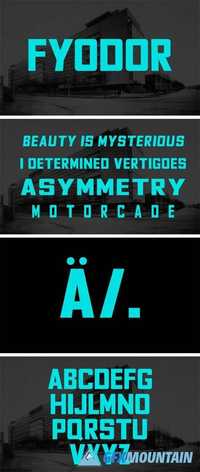
Fyodor provides powerful headlines and dramatic titling for editorial projects. The typeface design features balanced oblong and square geometric spaces, inside the classic forms of the Constructivist-era typefaces. The font family comes in 274 characters with Latin, Western European, Cyrillic and Greek language support, and is available in a bold weight with regular, condensed and expanded styles, both normal and oblique.
Read more

Yellow Numbers Font Family

Yellow Numbers Font Family

Yellow Numbers Font Family
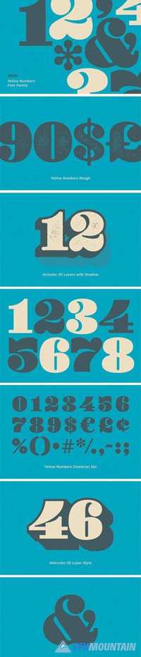
Yellow Numbers™ is a collection of fat, funky numbers and symbols in regular, soft and rough versions. Each subset has 3D and shadow layers for added pop. The rough family features 5 different distress options for every character. Desktop and webfont licenses are included.
Read more

FS Albert Font Family

FS Albert Font Family

FS Albert Font Family

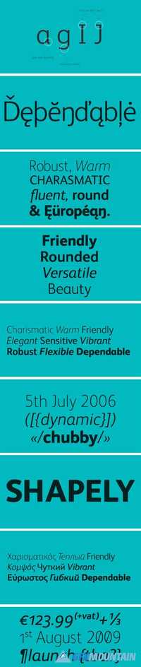
How do you make a font like FS Albert unique, distinctive? “When designing a font I try to question every letter,” says Jason Smith, “but all you need is a few that have an x factor. With FS Albert, they’re the lowercase ‘a’ and ‘g’ and the uppercase ‘I’ and ‘J’. “I remember a friend saying, ‘Why on earth have you designed the ‘a’ like that? Isn’t it too friendly for this kind of font?’ And, in a way, that’s what I wanted – honesty and warmth, because a lot of big brands at the time really needed to show a more human side.”
Read more

Eksell Display Font Family

Eksell Display Font Family

Eksell Display Font Family
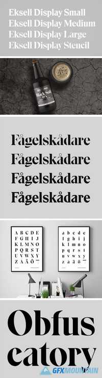
Eksell Display is a unique typeface from 1962, designed by the legendary swedish designer Olle Eksell (1918–2007). Olle was a prolific artist who couldn’t resist sketching out whatever ideas came to mind. His work covered a broad range, but this was the only complete typeface. The letters were drawn in Olle’s five square meter studio in Stockholm, six years after he designed the classic Mazetti eyes. We carefully digitized the letters and developed a family of four optical styles, including a stencil version. Have fun with it, we think Olle did.
Read more

Jerrad Beautiful Serif Font Family 1678268

Jerrad Beautiful Serif Font Family 1678268

Jerrad Beautiful Serif Font Family 1678268
OTF, TTF, WEBFONT | 2.1 Mb

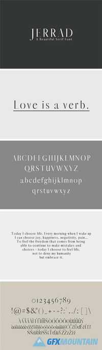
Jerrad A Beautiful Serif Font Family is a clean and beautiful serif font family, which contains 4 weights and Jerrad features unique and modern serif look and feel. Perfect for gorgeous logos, titles, web layouts and branding. It looks gorgeous in all caps with a wide-set spacing if you want to try a classy look, or beautiful on its own in capital and lowercase letters for something completely timeless.
Read more

Shore A Carefree Font Family 1647710

Shore A Carefree Font Family 1647710

Shore A Carefree Font Family 1647710
6 OTF 6 TTF 6 WOFF | 747 Kb

Shore is a carefree sans-serif font family, that has been designed to create fun yet sleek designs and branding. It works well for pretty much anything, due to its clean and contemporary lines and rounding. it works especially well for industries such as apparel, perfumes & colognes, food & drink, beauty, travel and homeware.
Shore comes with the original font, plus the italic, rough and rounded versions, so you can use it for your entire project without needing anything else. Alternatively it pairs great with script fonts or thin sans-serifs.
Read more

Bracken A Hipster Font Family 1647711

Bracken A Hipster Font Family 1647711

Bracken A Hipster Font Family 1647711
6 OTF 6 TTF 6 WOFF | 486 Kb

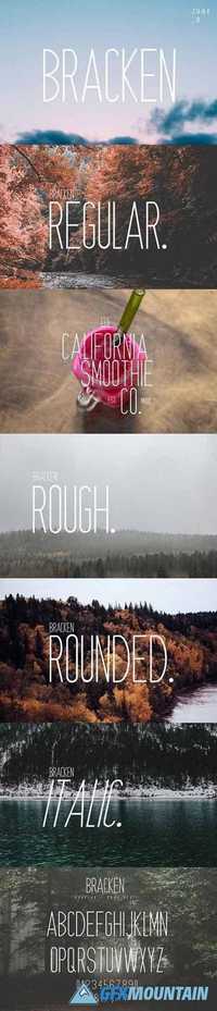
Bracken is a hipster font family, designed to add an edgy, modern and casual style to all your designs. Bracken comes with its original font, rough, rounded and italic versions, so you won't need anything else to create amazing work!
Bracken has been designed for up and coming businesses, branding, signage, and logotypes, but is versatile enough to work with anything you choose! It works particularly well for the food and drink, beauty, hospitality and events industries.
Read more

Avenir Next Pro Full Family

Avenir Next Pro Full Family

Avenir Next Pro Full Family

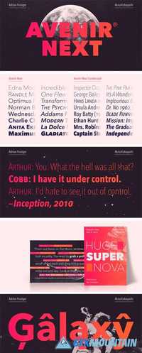
Avenir Next Pro is a new take on a classic face—it’s the result of a project whose goal was to take a beautifully designed sans and update it so that its technical standards surpass the status quo, leaving us with a truly superior sans family. This family is not only an update though, in fact it is the expansion of the original concept that takes the Avenir Next design to the next level. In addition to the standard styles ranging from ultra light to heavy, this 32-font collection offers condensed faces that rival any other sans on the market in on and off—screen readability at any size alongside heavy weights that would make excellent display faces in their own right and have the ability to pair well with so many contemporary serif body types. Overall, the family’s design is clean, straightforward and works brilliantly for blocks of copy and headlines alike. Akira Kobayashi worked alongside Avenir’s esteemed creator Adrian Frutiger to bring Avenir Next Pro to life. It was Akira’s ability to bring his own finesse and ideas for expansion into the project while remaining true to Frutiger’s original intent, that makes this not just a modern typeface, but one ahead of its time.
Read more

Retiro Font Family

Retiro Font Family

Retiro Font Family

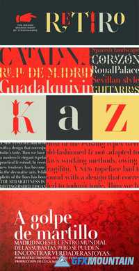
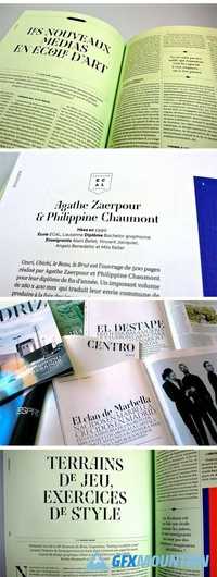
Retiro is a daring interpretation of Spanish typography. Severe, austere and yet, full of life, Retiro is a vernacular version of Castilian and Andalusian in a typical Didot. Named after a lovely park in Madrid, Retiro started life as a a bespoke typeface designed to give a unique voice to the magazine Madriz. In 2006, the founder of Madriz was looking for a Didot for his new magazine. The Didot is the archetypal typeface used in high-end magazines. Retiro, based on Ambroise is a synthesis of these high contrast styles mixed with an Hispanic mind. Result is then, after 2-3 years of work, a typeface with countless variations – Retiro in 2009 included 470 glyphs – to establish typographic shades adapted to different sections and pages of the Madriz.
Read more

Scania Sans Font Family

Scania Sans Font Family

Scania Sans Font Family

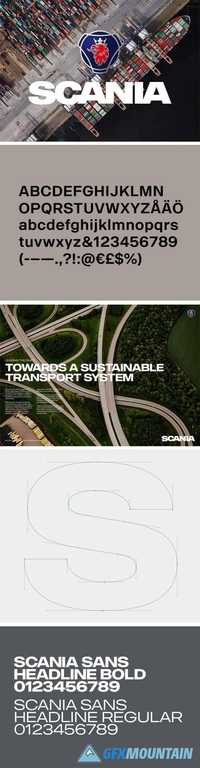
With the aim to be the leader in sustainable transport, Scania builds its business while creating value for customers, employees and society. Delivering customised heavy trucks, buses, engines and services, focus is always on efficient, low-carbon solutions that enhance customer profitability. With design direction by Brand Union Stockholm we have developed a wide type family with 8 styles and updated the classic word mark.
Read more

Pally Font Family

Pally Font Family

Pally Font Family

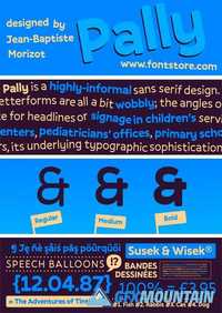
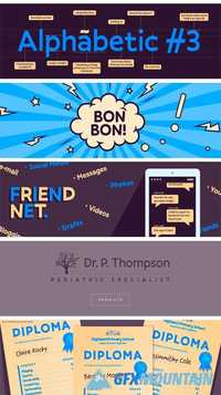
Pally is a highly-informal sans serif design. Its three weights were designed by Jean-Baptiste Morizot. Pally’s letterforms are all a bit wobbly; the angles of many letters’ strokes are atypical – just look at the capital ‘A’ – and the left and right-hand-sides of many letters are not the same size or height (e.g., the lowercase ‘a’ and ‘n’). As a result, Pally has a lot more character than most sans serif typefaces. It could be an excellent choice for headlines or signage in children’s services projects, like family centers, pediatricians’ offices, primary schools, etc. Once you begin to understand the different rhythm that Pally offers, its underlying typographic sophistication becomes clear. The ascenders of the lowercase letters, rise above the heights of capital letters and numerals. The lowercase alphabet includes a double-storey ‘a’, a single-storey ‘g’, and a Jensonian ‘e’, with a diagonal stroke in its middle-section. Each Pally weight has been drawn in a more-or-less monolinear fashion. In the fonts’ extended character sets, there is plenty of space between each letter and diacritics that come on top of it.
Read more