Lyno Font Family

Lyno Font Family

Lyno Font Family
4 OTF
Lyno was designed by Karl Nawrot and Radim Pesko between 2009 and 2012. It is available in four syles. The characters of Ulys(ses 31), Stan(ley Kubrick), Jean (Arp) and Walt (Disney) negotiate the digital freedoms of their production through playful typologies of form. They are open and various, and their spirit is this: to resist normative tendencies and to reject the idea of definitive form.
Read more

FM Font Family

FM Font Family

FM Font Family
14 TTF
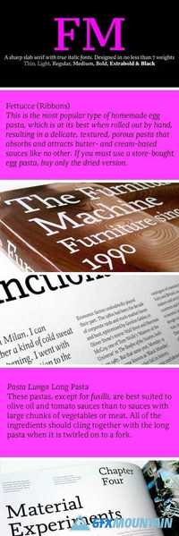
A versatile slab serif face that combines modernity with timelessness, available in five weights with corresponding italics. An ideal font for editorial use that is suitable for all requirements; headlines, body copy, pull quotes and captions.
Read more

Backspacer Font Family

Backspacer Font Family

Backspacer Font Family
PFB
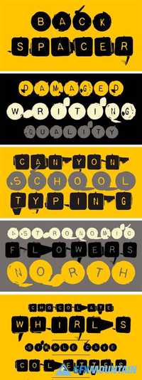
Years ago, by happenstance, designers Nancy Mazzei and Brian Kelly found an old decrepit typewriter in an abandoned lot with tall grass in Brooklyn. They kept it around their apartment for two years. Then one day they decided that it was time to move and they planned to throw the old typewriter away. But it was so beautiful they wanted to keep at least a part of it. So they decided on keeping the keys. They kept the keys in a brown bag until one fine day the keys were introduced to a camera. It was a match made in heaven that resulted in some beautiful quirky images of typewriter keys. These images were the inspiration for Backspacer. They were scanned, traced and turned into a working typeface by Zuzana Licko.
Read more

November Font Family

November Font Family

November Font Family
18 OTF
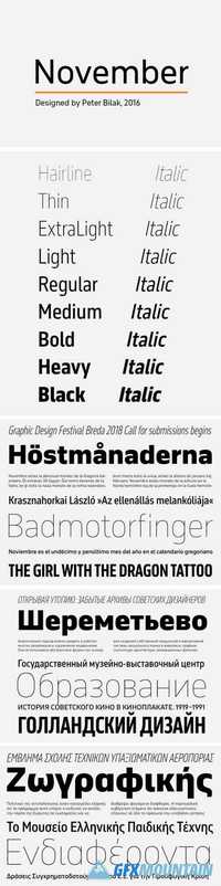
Sometimes there are situations when a friendly typeface is too imposing. Sometimes you just want to use a typeface to get the job done. November is a rational, utilitarian typeface inspired by street signage. Unlike most signage types it also handles long texts with ease. While most tool-based typefaces feature angled terminals, November’s end strokes are always straight, anticipating the following letter, creating distinctive counterspaces that support the visual rhythm of the words.
Read more

Neutral Font Family

Neutral Font Family

Neutral Font Family
6 OTF
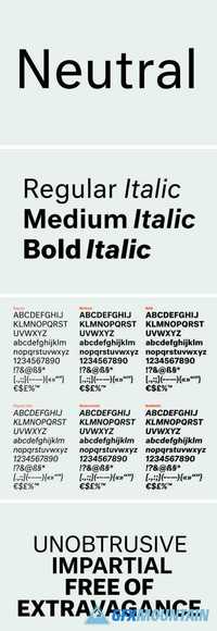
Neutral began as Kai Bernau’s graduation project at KABK (the Royal Academy of Art, The Hague), taking inspiration from typefaces that seem ageless, remaining fresh and relevant even decades after they were designed. It was constructed based on a set of parameters derived by measuring and averaging a number of popular 20th-century Sans Serif fonts (Kai published a book about the project too). Aware that there is no such thing as total neutrality, this typeface explores how the absence of stylistic associations can help the reader to engage with the content of a text.
Read more

Massimo Font Family

Massimo Font Family

Massimo Font Family
14 OTF
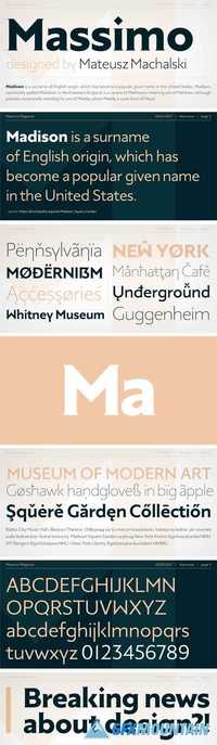
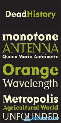
Massimo is a semi-serif geometric type family. For as long as I can remember, I've admired the visual style of New York – its architecture, fashion, design, and typography. After spending two weeks in Manhattan this summer, I wanted to prepare a sharp and modern typeface in Big Apple style.
Read more

Publico Text Font Family

Publico Text Font Family

Publico Text Font Family
6 OTF
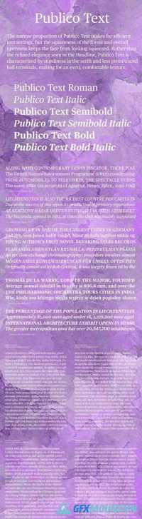
The narrow proportion of Publico Text makes for a very efficient text face, but the squareness of the forms and overall openness keeps the text from looking squeezed. From Publico Headline to Publico Text, elegance gives way to sturdiness in the serifs and less pronounced ball terminals, making for an even, comfortable texture in text.
Read more