Market Sans Font Family

Market Sans Font Family

Market Sans Font Family

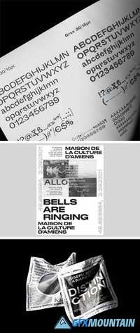
We worked with the eBay brand team and the New York based design agency Form&. Market Sans’ style came from the Capital typeface, a font from our Lab department. eBay bought the exclusive rights for developing a complete font family and taking it out of the market. This typeface was a fusion between the neo-grotesque style of the Suisse Int’l and the geometric shapes of the Euclid Flex typeface. Market Sans is a brand-new family including six weights with italics.
Read more

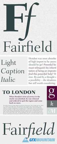
Fairfield Font Family

Fairfield Font Family

Fairfield Font Family

Fairfield is a fifty-year-old typeface that has had a recent facelift. Rudolph Ruzicka, artist and book illustrator, designed light and medium weights of Fairfield for Linotype in 1940 and 1949, respectively. For Fairfield’s 1991 release as an electronic typeface, designer Alex Kaczun added bold and heavy weights. With its straight, unbracketed serifs and abrupt contrast between thin and thick strokes, Fairfield harks back to the modern typefaces of Bodoni and Didot, but has a distinctly twentieth-century look. Fairfield is a fine text face, both for books and shorter texts. Kaczun added small capitals and old style figures, swash capitals, and a set of “caption” typefaces (sloped roman style) that were inspired by Matthew Carter's extensions to Oldstyle 7 for National Geographic magazine.
Read more

Practice Font Family

Practice Font Family

Practice Font Family

Francois Rappo’s latest project is a significant outcome of his design practice anchored in the research of typographic paradigms. In the mapping of serif typography, Practice introduces a new perspective with an unprecedented sharpness. While its architecture revisits the elegance of Renaissance typography, an innovative calligraphic drawing was achieved to reach a crisp digital identity. The precise texture of Practice is outstanding on both paper and screen. The optical balance of the text rythm offers a clear reading with a contemporary aesthetic. Practice is declined in a consistent gradient of styles to provide a complete tool for magazines, books and newspapers. The family is structured in three display weights designed for larger sizes and six roman weights for smaller sizes plus their matching italics. Each style offers five series of numerals, small caps and an extended ligature set.
Read more

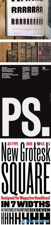
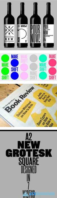
New Grotesk Square Font Family

New Grotesk Square Font Family

New Grotesk Square Font Family

A suite of 7 condensed fonts inspired by printed wood and display type from A2-TYPE’s archive of historical specimens and printed ephemera. The New Grotesk Square family comprises a series of condensed fonts designed with unified proportions across all widths; from ONE to SEVEN, to create a varied palette of fonts for the modern designer.
Read more

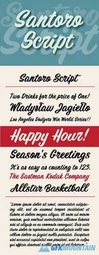
Santoro Script Font Family

Santoro Script Font Family

Santoro Script Font Family

Santoro Script is a fun, happy script font created in the style of handpainted sign lettering. It displays a jubilant attitude which will add a spontaneous, warm and friendly look to any design. The typeface contains at least three versions of every letter found under the Swash and Stylistic Alternates OpenType features as well as a few additional letter versions and ligatures under the Titling and Discretionary Ligatures OpenType features. These extra alternates help give the font a hand painted feeling. Jukebox fonts are available in OpenType format and downloadable packages contain both .otf and .ttf versions of the font. They are compatible on both Mac and Windows. All fonts contain basic OpenType features as well as support for Latin-based and most Eastern European languages.
Read more

Tertre Font Family

Tertre Font Family

Tertre Font Family

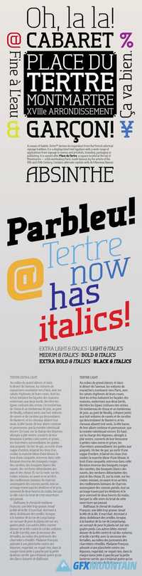
Tertre is a display/short text typeface with a wide range of applications from signage or posters to menus and pricelists; branding, packaging or publishing. It is named after Place du Tertre, a square located at the top of Montmartre—a hill overlooking Paris, made famous by the artists of the 19th and 20th Century. Like in Galette, the letters have no overhangs and the stroke thickness of capitals and lower case letters is identical, making hinting or anti-aliasing more uniform at any point size and zoom combination.
Read more

Chiswick Sans Font Family

Chiswick Sans Font Family

Chiswick Sans Font Family

Chiswick Sans demonstrates that the past can offer inspiration for new typefaces which are not slavishly historical. The high contrast sans serif offers a letterform that shares the unadorned simplicity of a low contrast sans, but also shares the beauty of a serif letter.
Read more

Aloha From Deer - Summer Font Family 1522804

 Aloha From Deer - Summer Font Family 1522804

Aloha From Deer - Summer Font Family 1522804
3 OTF
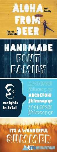
Let say "aloha" to upcoming summer... It's a friendly and welcoming typeface arriving in three different weights. Created to be positive and easy going. :) Font has been sketched by hand and post processed in adobe illustrator. So, there are no rough lines or edges. Simply size this font as you want - it will stay smooth and precise as you see now.
Read more

FF Brokenscript Font Family

FF Brokenscript Font Family

FF Brokenscript Font Family
4 OTF
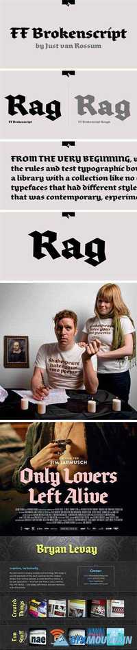
Dutch type designer Just van Rossum created this blackletter FontFont in 1991. The family contains 2 weights: Bold and Condensed and is ideally suited for advertising and packaging, festive occasions, editorial and publishing, logo, branding and creative industries as well as poster and billboards. FF Brokenscript provides advanced typographical support with features such as ligatures, alternate characters, case-sensitive forms, and stylistic alternates. It comes with proportional oldstyle figures. This FontFont is a member of the FF Brokenscript super family, which also includes FF Brokenscript Rough.
Read more

Alternate Gothic Font Family

Alternate Gothic Font Family

Alternate Gothic Font Family
3 TTF
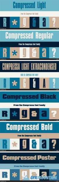
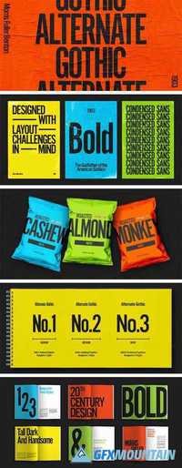
Alternate Gothic was designed by Morris Fuller Benton for American Typefounders Company in 1903. All three weights of Alternate Gothic are bold and narrow. In fact, this face is essentially a condensed version of Benton’s other well-known sans serif types, Franklin Gothic and News Gothic. In the early twentieth century, the modern concept of type “families” had not yet been formed — and though Benton designed these sans serifs to harmonize with each other, the foundry gave them different names. Robust, dark, and coolly competent, Alternate Gothic is a good choice when strong typographic statements must fit into tight spaces. As a modern usage, it is currently the font of YouTube’s homepage logo.
Read more

Bauer Bodoni Font Family

Bauer Bodoni Font Family

Bauer Bodoni Font Family
8 OTF
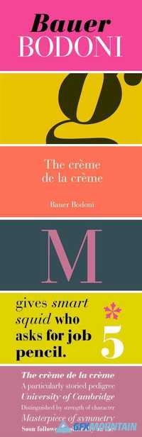
Firmin Didot cut the first modern face about 1784 in Paris; Giambattista Bodoni followed prolifically on his heels; his punches and matrices survive in Parma. Bauer has produced the most faithful and delicate contemporary version of his types.
Read more

Eleganza Font Family

Eleganza Font Family

Eleganza Font Family
4 OTF
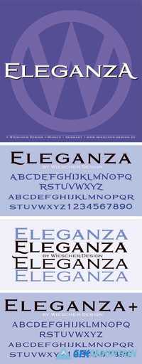
Eleganza is my most elegant typeface. At least that is what I think! I use it for business cards and everything that has to be elegant with that extra touch.The font comes in pairs for the price of one. The “plus” version being the one with less embellishments.
Read more