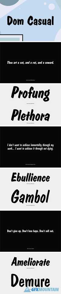
Astro SE Font Family
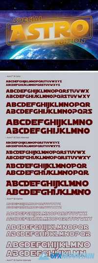
Astro SE Font Family
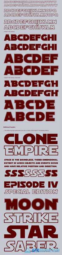
ASTRO is a bold sans serif display typeface inspired by one of the most popular space fantasy films of all time. This Special Edition of Astro™ includes
capital letters drawn in the classic style of the original 1977, 1980 and 1983 films and lowercase letters featuring the updated letterforms from the Special Edition films in 1997 and 1998. Astro SE™ has been used as a Star Wars font in publications, signs, posters and websites, including The Star Wars™ Insider Magazine, The Force.net website the Clone Wars Podcast and Lego Star Wars products. First released in 1996, Astro SE™ (v5) was re-designed in June 2008.