Odds Font Family

Odds Font Family

Odds Font Family
5 OTF
Say hello to Odds - a versatile, chunky casual sans with lots of personality! It’s fresh, friendly and easy to read. It is also a great mix of boldness and cuteness, so it definitely captures attention.
Read more

Neo Latina Font Family

Neo Latina Font Family

Neo Latina Font Family
2 OTF 2 TTF
Neo Latina is a classic sans serif typography in small caps of square proportions and rectilinear character with the ends of the rounded horns and a semi-stencil design that gives a futuristic aspect and of science fiction.
Neo Latina is the right heiress of geometric fonts from the early 20th century inspired by the Bauhaus school and is specially designed for use in any size for both screen and print.
Neo Latina is a very versatile typography for graphic design, you can use it in advertising posters, video games, film titles, logos, editorial design, etc.
Read more

Morl Font Family

Morl Font Family

Morl Font Family
60 OTF 60 TTF
Developed from condensed san serif families of the 90’s to 00’s, Morl brings together the distinctive features of the time but presented in a simpler design. Its potential is increased with Original, Sans, and Rounded options which offer varied moods. Suitable for publications, web and product designs, Morl can fit either headlines or body. It’s also effectively supported in various devices. The family comes in 10 weights, making it available to use for your required tasks in 60 styles.
Read more

Aquino Font Family

Aquino Font Family

Aquino Font Family
5 OTF 5 TTF
Aquino is a display calligraphic stencil typeface inspired by a liturgic book made by portuguese friar Tomas Aquino in 1735 – Collectaneum Sacri Ordinis Cisterciensis ad usum Congregationis S. Mariae de Alcobaca.
Friar Aquino’s Calligraphy shows a distinctive typographic flavour with a uniform and consistent execution of the serifed letters. He also wrote with unconnected strokes, resulting in stencil-like letterforms.
We analysed and followed the structures of Aquino’s minuscules, and used as models lowercase letters from different parts of the book. The design of the uppercase letters however is mostly original, as we decided to make them more consistent with the lowercase shapes and their logic of construction, instead of reproducing Aquino’s decorative majuscules.
Read more

Skilt Gothic Font Family

Skilt Gothic Font Family

Skilt Gothic Font Family

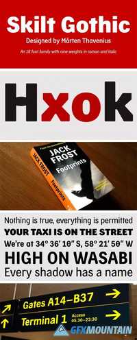
In the 1920s the Danish architect, printer and designer Knud V. Engelhardt made some striking typefaces for signage. The Swedish typeface designer Marten Thavenius used some structural elements from the work of Engelhardt when he designed Skilt Gothic—a typeface to be used for display and text settings in the 21st century. Skilt Gothic comes in nine weights—thin, light, regular, medium, semibold, bold, extrabold, black and ultra—in roman and italic respectively. A wide range of glyph alternatives are accessible through OpenType features. Skilt Gothic has support for more than 50 languages.
Read more

First Prize Font Family

First Prize Font Family

First Prize Font Family

First Prize typeface has simple shapes. It is a narrow, heavy sans serif typeface with geometrical logic and quite predictable constructions of characters. The idea behind it was to combine constructed structure of the skeleton and some calligraphic ideas, swashes and cursiveness. At the moment First Prize typeface consists of three narrow styles: bold, upright italic and italic. Cursive weights have beautiful ending swashes and initials. There are few alternative shapes for A&N. As a Display typeface First Prize will work very well with any other typefaces for the good of any project in print or online.
Read more

Grind Font Family

Grind Font Family

Grind Font Family

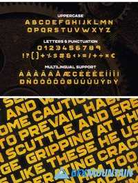
Grind is a big and bold display typeface that oozes strength and toughness. Grind features simple, demolished, halftone and timber styles. It also comes with multilingual support and includes letters, numbers and punctuation.
Read more

PF Diplomat Sans Font Family

PF Diplomat Sans Font Family

PF Diplomat Sans Font Family

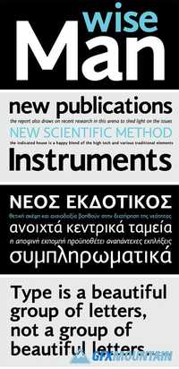
A clean humanistic sans-serif typeface which complements its serif version Diplomat Serif. It has preserved several of its original characteristics and comes complete with true-italics with a distinct flowing structure. Supports Latin and Greek.
Read more

TheSerif Font Family

TheSerif Font Family

TheSerif Font Family

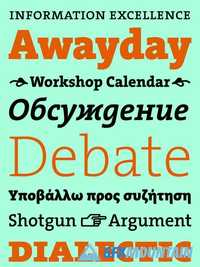
TheSerif is part of the Thesis superfamily which Luc(as) de Groot first published in 1994. It was conceived to be the perfect secondary font within the Thesis system, using it for headlines, subheads, pull quotes, etc. TheSerif has also been used successfully as a text font in its own right. TheSerif is a low-contrast typeface – i.e., the differences between thin and thick strokes are not very pronounced. Yet the reference to writing with the broad-nibbed pen is still present, giving the letters a diagonal stress and a forward flow that facilitates reading. The roman letterforms tend to have some characteristics of an italic or written construction. Yet the italic forms themselves are very distinctive: they were not derived from the upright but were individually designed while perfectly complementing the roman forms.
Read more

Neue Haas Grotesk Pro Font Family

Neue Haas Grotesk Pro Font Family

Neue Haas Grotesk Pro Font Family

Christian Schwartz sees his version of Max Miedinger’s seminal Swiss Modern sanserif as “primarily a restoration.” Reclaiming the warmer personality of the Haas original, he reinstated smoother curves and undid the compromises of intervening technologies and a one-size-fits-all approach. In a range of weights tailored to today’s publications, separate fonts for Text and Display now excel at their respective tasks;
Read more