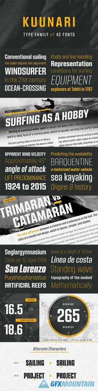
Kuunari Font Family 42 OTF Kuunari is structured square sans type family of 42 fonts. It has three widths and 7 weights in both upright and italic versions. The base form is a round cornered rectangle and this form constructs the glyphs throughout the fonts. Kuunari is a straightforward sans serif. It doesn't make any fuzz about itself, it just does the job proudly and with confidence. It is very versatile; it can be used for titles and logos to make a statement or more delicately for body text and lead paragraphs. All in all you can achieve diverse and rich typography with the Kuunari type family.
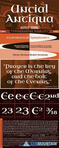
Uncial Antiqua Pro Font Family OTF TTF Our Uncial Antiqua Pro is a hybrid typeface which combines the speedier penned styles of Uncial and Half Uncial letterforms together in a formal text representation. Signature letterforms to the Uncial & Half Uncial styles are not sacrificed in this compilation, yet readability is surprisingly maintained when read in context. The SmallCaps and extensive figure sets only further expand the range of usability and appeal.
Sax Font Family 2 OTF TTF Sax is a professional, elegant and high end serif design by Coen Hofmann, published in 2008 by URW. The Sax family contains three effective weights of regular, bold and italic, along with a small caps weight.
JT Leonor Font Family 20 OTF JT Leonor is inspired by the world renowned Gotham typeface but with a more square feel in its light weights and a rounder bold range, this typeface is perfectly suited to both large chunks of body copy as well as large headlines.
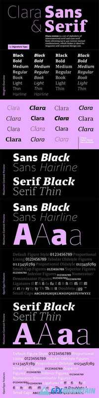
Clara Serif Font Family 14 OTF 14 TTF Clara is a set of alphabets of interconnected serif and sans serif fonts. The connection is not only in the intensity of the strokes, i.e. in the identical brightness of the typesetting, but also in the drawing principles of both alphabets. The typeface aims to offer a sense of calmness for a reader even in smaller scales of the typesetting. In large scales it builds on the purity of the image without additional decorations. The Clara system includes maximum equipment of a Latin font from Thin to Black in all versions of marking fonts, italics, capital letters and four kinds of numbers. The typeface allows typesetting of the vast majority of cultural languages of the world.
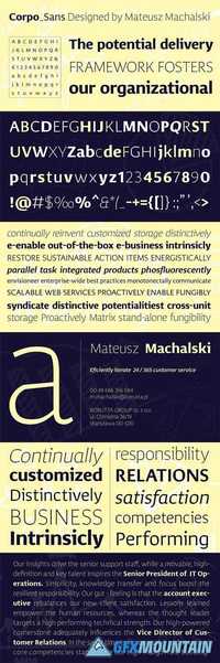
Corpo Sans Font Family 12 OTF 12 TTF Corpo Sans is REFRESHED version of my old font Korpo Sans. Corpo Sans is a sans type family with a friendly feel. This type contains 12 variants with 6 weights.The high contrast and high x height is perfect for headlines and display uses.
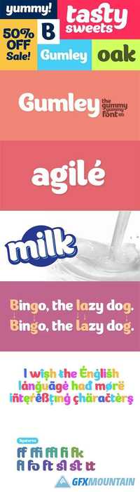
Gumley Font Family 2 OTF 2 TTF Gumley - a font which has a fresh natural look and feel inspired by nature, at the same time it has a gummy feel which would fit very well on packaging design. With a little inspiration every product can look awesome with this font, starting from kids magazines to logos and package design.
Raleigh is an antique, heavy serif typeface originally designed by Adrian Williams and Robert Norton in 1977. It contains a conservative, American advertising feel and is loaded with 12 weights in the complete family. It contains language support for West, East, Turkish, Baltic, and Romanian.
The designer pack included Bifocals Grotesk and 10 Superior illustration. Inspired by the minimalist, geometric, and contemporary art. Bifocals Grotesk made with geometric and modern concept, designed by Habib Otang. Inspired by Modern Style & Industrial Era Typographic and Graphic design. Come with 4 families to mix and match your design.
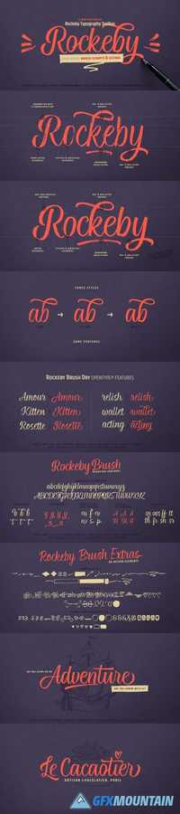
Rockeby Brush is a new font family that joins a well known collection - Rockeby Typography Toolbox. It contains 3 brush fonts - Dry, Rough and Clean - and a Brush Extras font that contains different design elements and graphic to complement your design whether it is a logo, website or a more complex design project. The Rough Brush font has a unique feature - the grunge texture that is applied not only to the letters but to the surrounding space as well.
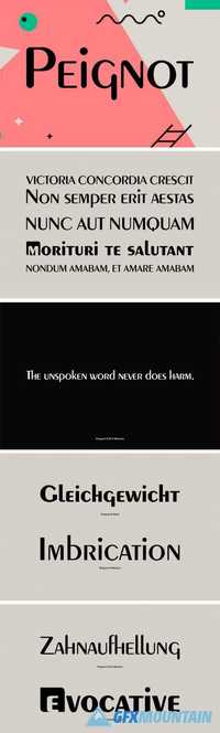
Peignot was designed by Adolphe Mouron Cassandre and Charles Peignot in 1936. Peignot is a classic type design that is well known for its avante garde lowercase letters. Great from retro and fashion themed projects.
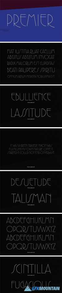
The fine line elegance of this 1920's and '30's style typeface was created at by one of the world's leading experts in type design, Colin Brignall. The lower case is refined with its long ascenders and complemented by capitals that can also be used alone. An excellent choice wherever a feminine, upscale look is desired.
URW Palladio (or known as Palatino) is the name of this typeface family that began as an old style serif typeface designed by Hermann Zapf initially released in 1948.
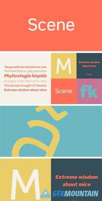
Work on Scene began some time after designer Sebastian Lester joined Monotype Imaging in 2000. Clean, calm, and highly legible — thus the design brief Lester set for himself. With Scene, he wanted to provide graphic designers and creative directors with a suite of fonts that would serve as a strong foundation for identity projects, incorporating what he had learned about on-screen and print legibility. Scene was developed during two years of after-hours and weekend work. The family comes in six weights with matching italics, there is a set of “semi-sans” characters to introduce more expressive word rhythms into headlines and blocks of copy.