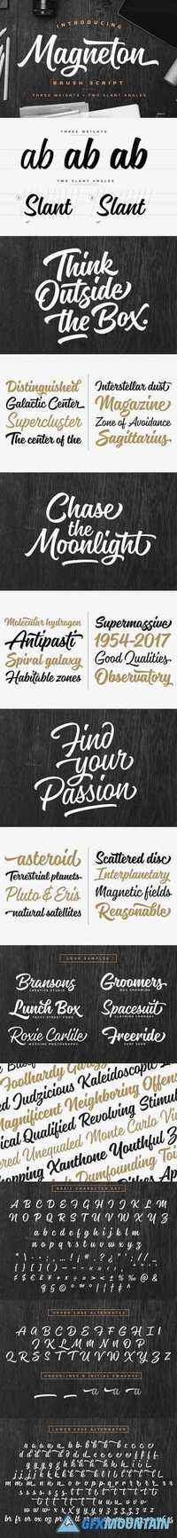
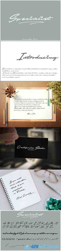
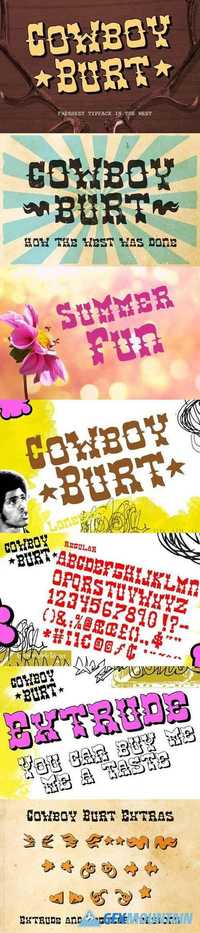
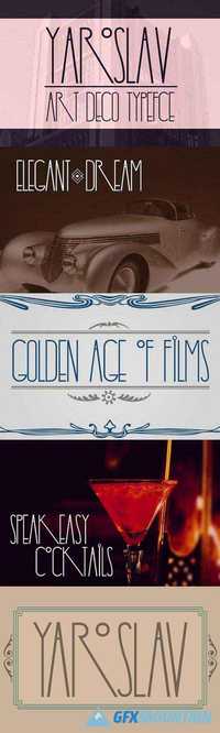
Comic Font 1347756
Comic Font 1347756
OTF TTF
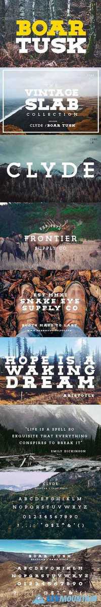
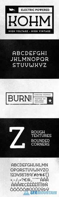
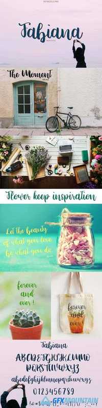
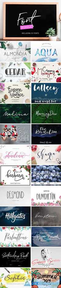
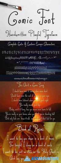
Darwinoo present my new cute and beautiful comic style handwritten font. It will nice to make your design cute and playful style. Contain 275 glyphs and supported to basic Latin character and eastern Europe language.
OTF TTF
Darwinoo present my new cute and beautiful comic style handwritten font. It will nice to make your design cute and playful style. Contain 275 glyphs and supported to basic Latin character and eastern Europe language.