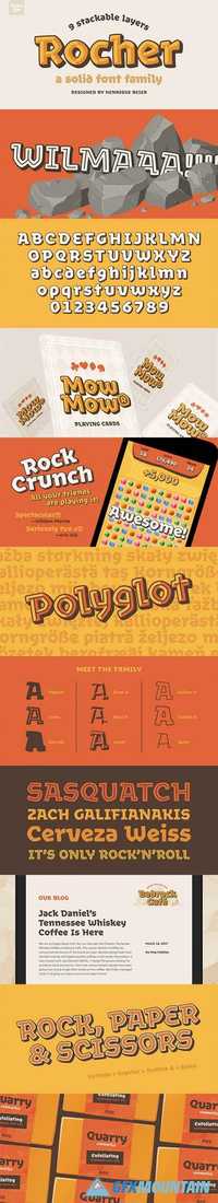
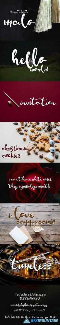
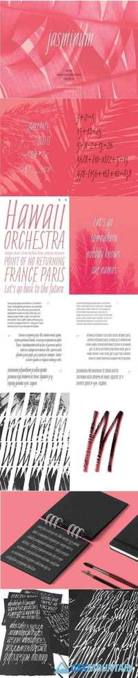
Foundry Font Kit

Foundry Font Kit

Foundry Font Kit
Have fun introducing you to a new premium font kit. It will be a great typography for your new project. lntroducing Foundry Font Kit! Foundry designed and shared by Micromove. Foundry is one of the best Stylish Hand Written Script. Best match for logos, header, Titles, Prints & other Creative process possibilities. Create a Extraordinary Typography / lettering results by using Foundry Font Pack
Read more

Chlakh Han Drawn Font

Chlakh Han Drawn Font

Chlakh Han Drawn Font
TTF | 200 KB

As you can see in my store, I am a lover of vintage. This font is a wonderful complement to vintage goods in my shop. That is why it is perfect for creating retro logos, badges, labels. However, the use of this font is not limited to just logos. It’s also suitable for t-shirt prints, food packaging, business cards, flyers, posters, ads, restaurant menus, signs, typography design, quotes and any graphic design.
Read more

Madinah Font 1482016

Madinah Font 1482016

Madinah Font 1482016
3 TTF 3 OTF | 180 KB RAR

This is Madinah font collection available 1 package 3 models font latest you can get now! With pleasingly updated calligraphy hand variations that have been given an additional hand-written combination of brush and ink. This font will look beautiful on all designs, Wedding design, branding materials, blog titles, quotes and invitations, business cards.
Read more

Mihawk Font Script 1592158

Mihawk Font Script 1592158

Mihawk Font Script 1592158
OTF TTF WEB
This is my recently font 'Mihawk' made from my originally handwritting for any typhography dry handbrushed, designed to combine perfectly and allow you to create stunning hand-lettering quickly and easily. Ideal for logos, handwritten quotes, product packaging, header, poster, merchandise, social media & greeting cards.
Read more

Chiswick Poster Font Family

Chiswick Poster Font Family

Chiswick Poster Font Family
Chiswick Poster is designed for the largest sizes, of 80 point and above, for headlines in magazines, for posters, for shop signs, or anywhere else a seriffed letter with distinction and refinement is needed. An early version of Chiswick served as the primary display typeface in the 2010 redesign of O, The Oprah Magazine by Robert Priest and Grace Lee, where its beautiful forms, particularly in the Poster size, gave a breezy opulence to feature openers and section heads. The character set has been greatly expanded; small capitals, a variety of figures, and many alternates, swash forms, and other typographic details are included in all sizes.
Read more

Defender Font Family

Defender Font Family

Defender Font Family
For a counterbalance to sweet and tender Andulka and Etelka, we assumed to create some masculine font havig serifs looking like offroad tyre claws. Slab-serif typefaces have always been welcomed for designing of magazine headlines and posters. For both purposes an extreme x-height is useful as well as robust character build – typical features of all 30 designs of Defender type family. Named after a vehicle, whose brand is since 2008 owned by Indian Tata company. The font is also very usable for corporate identity and branding.
Read more

Comenia Serif Pro Font Family

Comenia Serif Pro Font Family

Comenia Serif Pro Font Family
Comenia was developed as typographic system (Comenia Sans, Comenia Script) for use on all levels of schools and universities. It introduces new aesthetic standards aimed at improving reading and writing skills and the perception of texts for pupils, students, teachers, office and IT staff at schools. It offers a clear, intelligible and universal graphic tool for layout of primers, textbooks, educational texts and materials, for electronic typography and for the information systems.
Read more

Comenia Sans Font Family

Comenia Sans Font Family

Comenia Sans Font Family
Comenia Sans was designed in the framework of a unique typographic project for all types of schools. It is a complementary face for Comenia Serif, released by our friends at Storm Type Foundry. Comenia Sans has a lot in common with its serif sister: the height of both upper and lower case, the length of ascenders and descenders, and the general weight. This makes the two perfect partners which work well even when set side by side in a single line of text. Comenia Sans does, however, lack all serifs, ornamental elements and stroke stress variation. All these elements freshen up the feel of long texts, but for shorter texts use, they are not necessary. Despite that, Comenia Sans retains the soft, friendly character of its big sister, as well as a few tiny details which lend it its unique character without compromising legibility or utility.
Read more