Guapa

Guapa
OTF
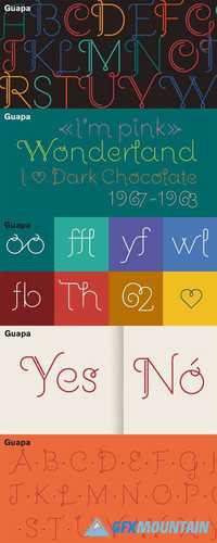
Guapa was first born from a personal experiment: transforming a geometric sans serif 'a la Futura' into a charming postmodern deco design. It was applied in a poster specially designed for a typography exhibition called ‘Pimp the type’.
Later it became a well-suited typeface for the word: from titles for magazines to book & record covers and packaging. The family consists in one single weight, which is provided with Discretionary ligatures, Alternative characters, Swashes forms, Initials and some Stylistic Sets. The Ornaments Series will be designed in the future, as well as a Cyrillic update. Guapa is fancy, delicious & fresh!