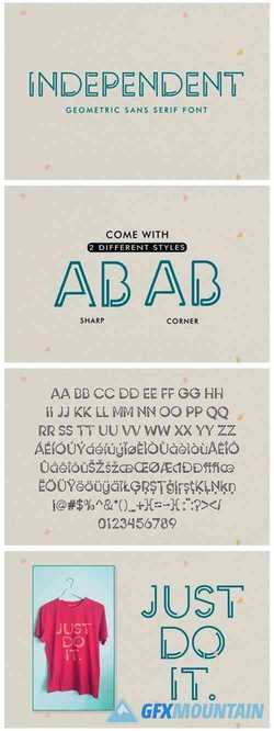
Independent Font Family
The Independent font family is a comprehensive suite of typefaces designed in 2013 for The Independent newspaper for their daily print and digital editions. The fonts were conceived and designed as a set of interconnected typefaces – sharing the same proportions and underlying structure – to create a coherent and balanced type family. In addition to the three master sets (Serif, Sans & Condensed), a special Serif Headline cut has been designed for display setting – a version of which is used for the newspaper’s masthead. Recently Sans Stencil and Slab fonts were added to the family to cater for a wider range of applications. The typeface was awarded top prize at the D&AD awards in 2014, and the Typeface Design prize at the Tokyo Type Directors Club awards in 2015.
The Independent font family is a comprehensive suite of typefaces designed in 2013 for The Independent newspaper for their daily print and digital editions. The fonts were conceived and designed as a set of interconnected typefaces – sharing the same proportions and underlying structure – to create a coherent and balanced type family. In addition to the three master sets (Serif, Sans & Condensed), a special Serif Headline cut has been designed for display setting – a version of which is used for the newspaper’s masthead. Recently Sans Stencil and Slab fonts were added to the family to cater for a wider range of applications. The typeface was awarded top prize at the D&AD awards in 2014, and the Typeface Design prize at the Tokyo Type Directors Club awards in 2015.

