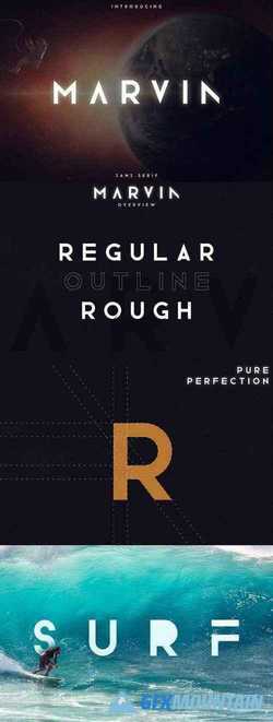
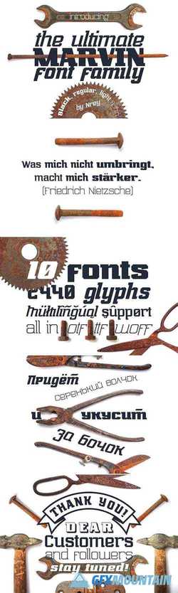
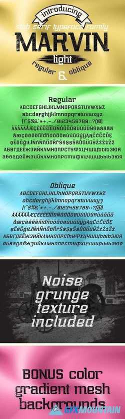
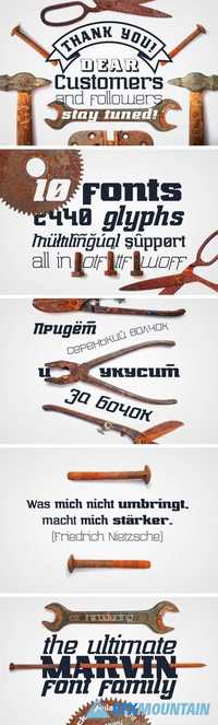
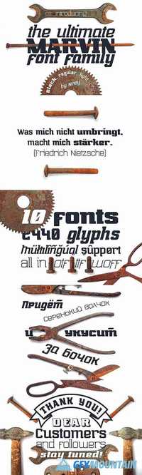
Marvin Light 1914891

Marvin Light 1914891

Marvin Light 1914891

Hello! Introducing MARVIN Light - slab serif typeface family. Font has semi-expanded width with slim strokes. Font looks amazing as alone words and as full text blocks. Also it good for bright captions and unforgettable logos
Read more

Marvin black 1855906

Marvin black 1855906

Marvin black 1855906
4 OTF 4 TTF 4 WOFF
Font inspired by Marvin Heemeyer history. It have strength, massive forms as bulldozer. Font looks amazing as alone words and as full text blocks. Also it good for bright captions and unforgettable logos It have supporting for many languages as: Czech, Danish and Norwegian, Deutsch, English, Espanol, French, Italiano, Magyar, Nederlands, Polish, Portuguese, Finnish, Swedish, Turkish, Russian and other based on extended latin.
Read more

Marvin pro 1981666

Marvin pro 1981666

Marvin pro 1981666
10 OTF 10 TTF 10 WOFF
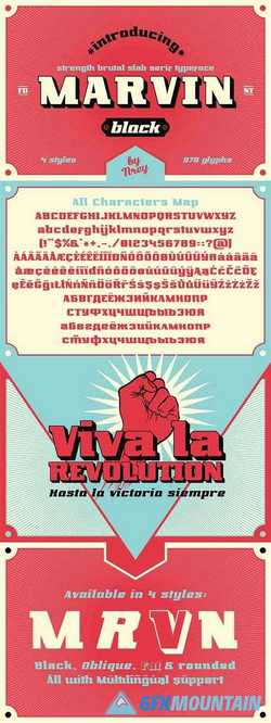
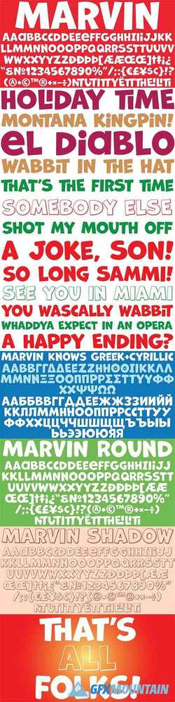
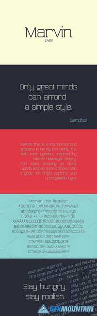
Font inspired by Marvin Heemeyer history. It have 4 weiths from strength, massive forms as bulldozer, to easy light thin lines. Font looks amazing as alone words and as full text blocks. Also it good for bright captions and unforgettable logos.
It have supporting for many languages as: Czech, Danish and Norwegian, Deutsch, English, Espanol, French, Italiano, Magyar, Nederlands, Polish, Portuguese, Finnish, Swedish, Turkish, Russian and other based on extended latin.
Read more

Marvin Visions Font

Marvin Visions Font

Marvin Visions Font

Marvin Visions is a more modern and consistent reinterpretation of Marvin, a typeface originally designed by Michael Chave in 1969 and published by Face Photosetting. It has been revived by Mathieu Triay for the identity of Visions, a new science fiction magazine that aims to be a literary introduction to the genre, mixing classic texts with new writing. When everyone is looking for their next workhorse, here comes Marvin Visions – a typeface with character, made to stand out. Like the original, it’s uppercase only and solely for display use. Unlike the original, this new design wants to be more sturdy and versatile. It has tight-not-touching default spacing, and it sports diacritics for most European languages as well as Cyrillic glyphs. It has been enhanced with a number of symbols, including arrows and an ‘at sign’, on top of a completely redrawn figure set.
Read more