Author Font Family

Author Font Family

Author Font Family

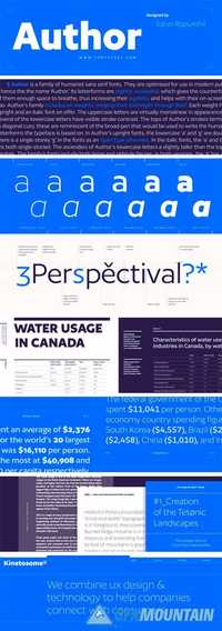
Author is a family of humanist sans serif fonts. They are optimised for use in modern publications – hence the the name ‘Author.’ Its letterforms are slightly expanded, which gives the counterforms inside of them enough space to breathe, thus increasing their legibility and helps with their on-screen rendering, too. Author’s family includes six weights, ranging from Extralight through Bold. Each weight has an upright and an italic font on offer. The uppercase letters are virtually monolinear in appearance; however, several of the lowercase letters have visible stroke contrast. The tops of Author’s strokes terminate in diagonal cuts; these are reminiscent of the broad-pen that would be used to write the humanist letterforms the typeface is based on. In Author’s upright fonts, the lowercase ‘a’ and ‘g’ are double-storied; there is a single-storey ‘g’ in the fonts as an OpenType alternate. In the italic fonts, the ‘a’ and the ‘g’ are both single-storied. The ascenders of Author’s lowercase letters a slightly taller than the tops of the capitals. The family’s fonts include both lining and oldstyle figures; in both versions, the ‘3’ has a flat top. Author comes from Satya Rajpurohit, the founder of Fontstore.
Read more

Bega Font Family

Bega Font Family

Bega Font Family

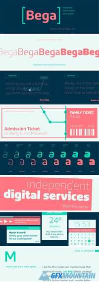
Bega is a simplified sans serif typeface. Formal reduction plays a strong role in its design. This is most visible in its ‘spurlessness.’ The visible strokes (or spurs) have been eliminated from the letterforms that would typically feature them. The lack of spurs in Bega is most-clearly visible when you look at the top-left corners of letters like ‘m’, ‘n’, and ‘r’. The Bega family includes eight weights, which range from Thin through Black. Each weight has two fonts on offer: An upright font, and an italic. Bega’s italics are obliques; their letterforms are slanted. The strokes of Bega’s letterforms all appear to be monolinear; that doesn’t mean that Bega is without contrast, however. Thanks to the family’s large number of weights – eight really is a lot – you can combine two or more of them with each other to create headlines that exhibit quite a bit of contrast! Each of Bega’s fonts includes a full range of numerators and denominators, to use when typesetting fractions, etc. The font’s numerals are proportional lining figures; these have the same height as Bega’s uppercase letters. The lowercase letters’ ascenders are tall, and they rise up above the tops of the capital letters and numerals. Bega’s friendly look makes it an ideal choice for use in corporate communication design. The typeface was designed by Sabina Chipar? and Diana Ovezea.
Read more

Paramaribo Font Family 1336943

Paramaribo Font Family 1336943

Paramaribo Font Family 1336943

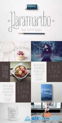
Meet Paramaribo, a hand lettered, cute and decorative font. Paramaribo family includes two fonts with stylistic substitutions and 28 ligatures. Perfect for designing ads, logos, prints, social media texts, blogs, wedding branding, quotes and so much more. Stylistic substitutions (those cute swashed end/beginning letters) are controlled by switching on/off OpenType feature as well as being accessible through glyphs panel in Adobe apps. Really very easy to use!
Read more

Mudstone Family 1607172

Mudstone Family 1607172

Mudstone Family 1607172
3 TTF 3 OTF | 587 Kb

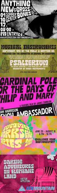
The cool, the sans and the light: Mudstone fonts are proudly packed with nice oddities and quirks. These are definitely fonts for getting noticed, in an affirmative, authentic way. Mudstone fonts are all caps, each with at least 2 sets of uppercase letters that will cycle at the command of the contextual alternates feature. There are also stylistic alternates in each font, for that extra something. Critically cool, seriously creative, dangerously unique. Definitely trying? Cool!!
Read more

Construct family font 1338046

Construct family font 1338046

Construct family font 1338046
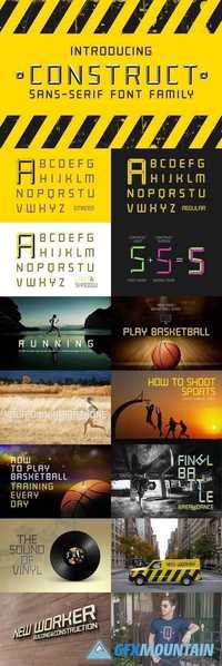
Introducing a new bold, sportive and industrial CONSTRUCT font family. Perfect combination of 2 fonts (Light and Shadow) to create your own layered 3D headlines, eye-catching texts, logotypes, design, posters for sports, music, street culture, modern arts, industries and many more other themes.
Read more

Brahmos Devanagari Font Family

Brahmos Devanagari Font Family

Brahmos Devanagari Font Family

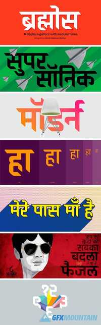
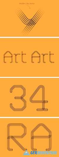
Brahmos Devanagari is a display family with modular forms. Despite looking like a constructed typeface, its characters appear to have been written with a broad-edged pen. Curves are eschewed in favor of straight lines and (usually) right angles, but diagonals are still present. Each weight’s character set has 780 glyphs, including all of the necessary conjuncts and ligatures for typesetting modern Indian languages written in Devanagari.
Read more

FS Dillon Font Family

FS Dillon Font Family

FS Dillon Font Family

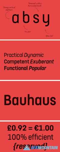
Geometric, economical, functional... The good, wholesome, modernist values that once fired up the tutors and students of the Bauhaus became the inspiration for FS Dillon after an exploration of the work of the pre-war art and design powerhouse in the Fontsmith studio. The font combines simplicity and directness with a characteristic Fontsmith warmth. Letterforms are compact, with a generous x-height, and built for maximum clarity and impact. The Bauhaus sought beauty through function. FS Dillon achieves it.
Read more

Defocus family font 1337704

Defocus family font 1337704

Defocus family font 1337704

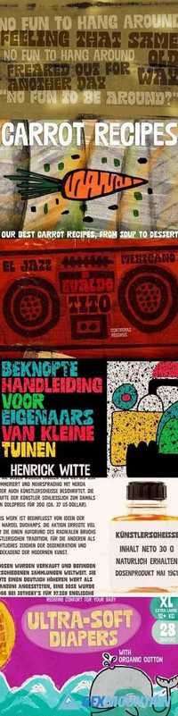
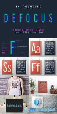
Say hi to Defocus font family. My personal favorite in this season. Font family consisting of three different fonts (different designs with different rough textures) as well as Mix Font with random mixture of all the letters of all three designs that gives crazzzziness to your quotes and designs. All three fonts are perfect for using with different colors for headlines, short bold texts, logotypes, quotes in blogs, tangible goods (prints on textile, mugs, and so much more).
Read more

FS Shepton Font Family

FS Shepton Font Family

FS Shepton Font Family

Andy Lethbridge had only just completed his graphic design BA at the University of Portsmouth when he was spotted by Jason, who’d seen Andy’s exquisite hand lettering at his degree show and on Instagram. Keen to push the handwritten theme further, having recently launched a digitally-created, chalky script font (FS Sammy), Jason offered Andy a job and the chance to develop a suite of more stylised, truly hand-drawn fonts. Andy duly got out his pads, pencils and pens, and started experimenting with styles and textures. Magic followed.
Read more

FS Conrad Font Family

FS Conrad Font Family

FS Conrad Font Family

In 2008, Fontsmith were approached by their friend, Jon Scott, to investigate whether a typeface could assume the aesthetic of one artist’s body of work. Jon’s not-for-profit charity, Measure, was organising an event for the artist, Conrad Shawcross, whose giant mechanical installation, entitled Chord, was going on public display in the long-disused Kingsway tram tunnel in Holborn. Chord explores the way we perceive time, as either a line or a cycle. Two enormous machines with dozens of rotating arms and moving in opposite directions, weave rope with almost infinite slowness.
Read more

P22 Morris Font Family

P22 Morris Font Family

P22 Morris Font Family

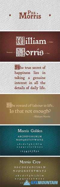
William Morris (1834-1896) was probably the most influential figure in the decorative arts and private press movements of the late 19th and early 20th century. In reaction to the increasing lack of quality that the industrial revolution brought on, Morris sought a return to the ideals of the medieval craftsman. Dissatisfied with the commercially available typefaces of the day, he undertook the design of the fonts for his books himself.
Read more

Takeaway Font Family

Takeaway Font Family

Takeaway Font Family
4 OTF
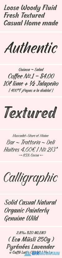
Takeaway is a hand drawn script family of three weights and ornament set. Takeaway is sketchy but due to its clean features it retains legibility even in small sizes - especially the Light version.
Takeaway is packed with OpenType features: Keep Contextual Alternates and Standard ligatures on for smooth flow and for more expressive character try Swash or Titling Alternates in any OpenType savvy program. Takeaway caps work as ALL CAPS - yet there’s also Swash and Titling caps that are more expressive initials.
Takeaway is a great organic display type for any project from branding to packaging and from websites to greeting cards.
Combine Takeaway Script with Takeaway Extras which is a set of sketchy ornaments, icons and swashes.
Read more