Intrepid Display Font

Intrepid Display Font

Intrepid Display Font
TTF
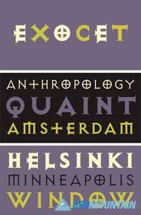
Intrepid is the perfect font for every adventurer. It maintains the clean, legible style of the sans you've come to love with some subtly-roughed edges to add character.
This font is great for making logos and sweet badges for your clients!
Read more

Mahalo Display Font

Mahalo Display Font

Mahalo Display Font
TTF
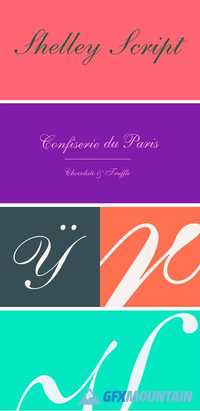
Aloha, my friends! Mahalo is a display typeface I crafted while soaking up the sun in beautiful Hawaii this summer. The people of Hawaii have been nothing short of amazing while welcoming my fiance and I, so it only felt right to name this font after them!
Read more

Axiom Bold Sans Serif Font 1531588

Axiom Bold Sans Serif Font 1531588

Axiom Bold Sans Serif Font 1531588
OTF
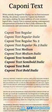
Axiom is a clean, minimal, modern serif typeface. It looks smooth in any layout with its sleek rounded lines, use it for your magazines, brochures and editorial layouts.
Axiom makes awesome headings, it looks great on its own or with imagery, body copy looks neat and tidy. Straus is one to add to your font collection.
Read more

FF Uberhand Font Family

FF Uberhand Font Family

FF Uberhand Font Family

“The casual handwriting font to end all other casual handwriting fonts.” Not faint praise, but how Jens Kutilek feels about the outcome of his, on and off, eight-year mission to create the ultimate suite of handwriting fonts. With two text-specific designs and 11 display typefaces, FF Uberhand™ is one of largest and most versatile handwriting designs available. The design guarantees legibility at small sizes and design integrity at the largest of sizes. Fitted character spacing, character edge definition and design subtleties were introduced into to the weights to create an ideal display design in FF Uberhand, while the FF Uberhand Text Regular and Text Bold designs were optimized for long-form text setting. Three variants of each letter – and up to four for the most common lowercase characters – were also drawn to create a spontaneous hand-lettered appearance. Whether in print or on screen, FF Uberhand brings a lively spontaneity to any project. An added benefit is that the FF Uberhand design pairs well with a wide range of typestyles. Geometric sans serif typefaces, like Century Gothic™ and Neue Kabel®, provide a dynamic contrast, Glyphic designs like ITC Elan™ and ITC Stone® Humanist or Gill Sans® Nova, create a subtle typographic rhythm. And pairing FF Uberhand with almost any serif typeface will produce a vibrant counterpoint.
Read more

Fresh Squeezed Font Duo 1604515

Fresh Squeezed Font Duo 1604515

Fresh Squeezed Font Duo 1604515
OTF | 832 Kb

Fresh Squeezed is a modern sans serif font duo that's perfect for your summer graphics. This font duo looks great on invitations, cards, packaging, logos, social media graphics and much more. If you are looking for a modern font duo with a fresh, summer aesthetic, give Fresh Squeezed a try.
Read more

F37 Ginger Font Family

F37 Ginger Font Family

F37 Ginger Font Family
OTF 8 TTF
F37 Ginger started out life as a pure Swiss modernist font, but as time went by, we just couldn't suppress the urge to give it an original and unorthodox geometric twist. We found ourselves repeatedly returning to the work of two legendary typographers throughout F37 Ginger's drawing process, namely Paul Renner and Herb Lubalin. Their early letterforms have been a constant source of inspiration. It was the alternatives in Renner's Futura font and Lubalin's Avant Garde Gothic, in particular, that paved the way for F37 Ginger's signature geometric shapes, and unusual near circular, counters. This makes it an ideal font for logos, headlines and body copy.
Read more

BC Reformulate Font Family

BC Reformulate Font Family

BC Reformulate Font Family
8 TTF
There aren’t many fonts on the market which naturally and function­ally combine strict rationality with humanistic calligraphy inspirations. Reformulate proves that even a non-proportional font, created using a very simple principle of shad­owing, need not appear cold, drab and artificial. Jakub Samek dis­plays a good sense of balance between the traditional and the calculated, between banal and thought-out. For him, optical impression and an aspiration for perfect legibility are more important than the perfect consistency of individual characters, taking a free, but educated approach. A geometrical construction, wrapped in an Illustrator brush stroke, was placed onto a cone of uniform width, as dictated by the tools and the grid. In spite of its coarseness in both principles and implementation, Reformulate later found a somewhat surprising application for its use.
Read more