Typographer's Font Bundle 804122
11 OTF 11 TTF 11 WOFF
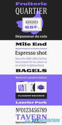
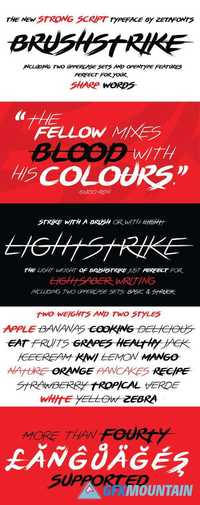
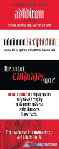
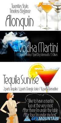
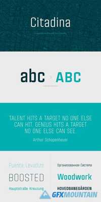
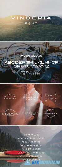
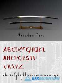
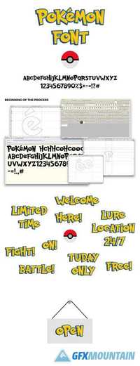
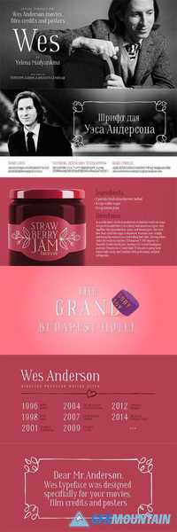
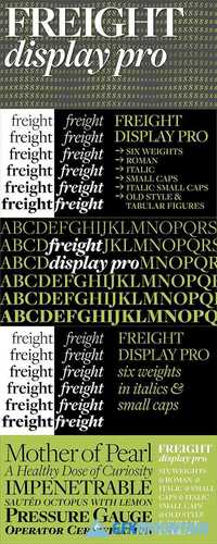
With just a little help, an ordinary project can be transformed into something extraordinary! This Mega Design Bundle features 5 unique fonts! From display to script fonts, you'll have plenty of themes to work with, no matter what your latest project. That's 5 fantastic fonts for 1 incredibly low price. You'll get a nice variety of styles, as well as various OpenType features to really mix things up nicely. Made up from more than 5 unique sets, you'll get a wide variety of fonts including: Paramount, Signature, Blizzard, Insomnia and Pathfinder. You can use as many of these items as often as you'd like on personal and professional projects without the need for any attribution. These fonts are a great resource for creating greeting cards, invitations, stationery, logos, banners, business cards and loads more!

