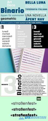
Binario Full Family

Binario Full Family

Binario Full Family
3 OTF 3 TTF
Binario is a geometric sans serif typeface. The design was inspired by elements of Italian Art Deco, early 1900s advertising, and shop signage. Binario to pays homage to early modernism’s optimism, modularity, and efficiency. The shapes of the rounded counters are based on the curve of the classic Roman arch. The bold and regular weights have a vertical emphasis and are suitable for headlines or large body text. The light is more open and provides a nice pairing to the regular or bold as body text or as large display text.
Read more

FULL TOOLS

FULL TOOLS

FULL TOOLS
OTF
Full Tolls is the younger brother of original Full Sans, Full Neue and Full Slab.

Full Tools started with Social Media Icons. In the following days coming new icons. For example "Full Tools - Communication" and "Full Tools - Emojis" and mode.
Read more

Lensbeby | Full Edition 836521

Lensbeby | Full Edition 836521

Lensbeby | Full Edition 836521
This photoshop action is designed to simulate the effect of a tilt-shift lens. Will be a great help in the processing of portraits, giving pictures macro effect, will improve your presentations, will help to focus on a separate object, will help to give Amateur pictures a professional look.
Read more

Vyoma Full Family

Vyoma Full Family

Vyoma Full Family
8 OTF
Joana Correia’s Vyoma is a friendly-looking typeface and an outstanding humanistic sans. Its letterforms appear both playful and nice. Several letters feature curved out-strokes: these are unusual for a sans serif design, but they definitely add personality. The counterforms in this design are very open, and they help create words that are highly legible and a joy to read. Try out Vyoma in a wide variety of applications, including corporate identity, signage, and text (onscreen and in print). In Hindi, “vyoma” is a word for the sky.
Read more

Stainless Full Family

Stainless Full Family

Stainless Full Family
59 OTF
One day in his sketchbook Cyrus Highsmith began hacking the serifs off his Dispatch characters, and liked this rough start. Like any good sans, Stainless depends upon much more than amputation. Lower contrast ratios, completely rethought spacing, and shapes reworked to occupy missing serif space led to a sanserif partner for Dispatch, and an interesting sanserif series on its own feet. Among other uses, Stainless is recommended for Newspaper, Magazine, Book and Corporate use.
Read more