Porter

Porter

Porter

4 OTF | JPEG Preview | 2.36 MB RAR
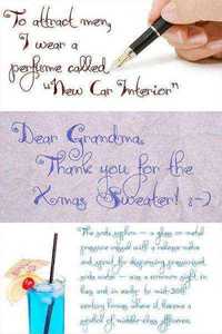
Hand lettered with a felt tip market, Porter makes a great addition to your growing font collection! Comes in FOUR weights : Light, Normal, Semi Bold and Extra Bold
Read more

GraphicRiver Picastro Blade & Drop 9120718

GraphicRiver Picastro Blade & Drop 9120718

GraphicRiver Picastro Blade & Drop 9120718

4 Fonts | OTF
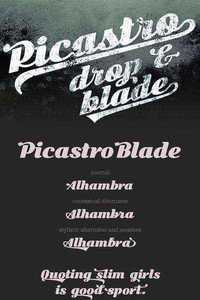
Picastro Bold by TypeFaith Fonts is a firm script with lovely swashes. It is a characteristic font with a retro feel. It contains a full set of ligatures, alternatives, swashes and special characters to end. The OpenType layout features can be used to position or substitute glyphs.
Read more

Pluto Italics Font Family

Pluto Italics Font Family

Pluto Italics Font Family

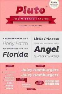
Type designer Hannes von Dohren has created Pluto, a sweet type family consisting of 16 Uprights and 16 Italics; 32 fonts in all. The fonts are informal and friendly at first sight and lend themselves to display settings, however the straight and upright architecture of Pluto also makes it perfect for longer copy. Because of its large x-height, it even performs nicely in very small sizes. This contemporary type family is ideal for use in retail, cosmetics, food and hospitality applications and advertising. Pluto is equipped for complex, professional typography. The OpenType fonts have an extended character set to support Central and Eastern European as well as Western European languages. Each font includes alternate letters, fractions, lining-, tabular numbers, scientific superior/inferior figures and a set of arrows.
OTF | 16 Fonts | JPEG Preview | 3.9 Mb RAR
Read more

Rolling Pen Font Family

Rolling Pen Font Family

Rolling Pen Font Family

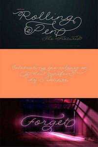
After doing this for so many years, one would think my fascination with the old history of writing would have mellowed out by now. The truth is that alongside being a calligraphy history buff, I'm a pop technology freak. Maybe even keener on the tech thing, since I just can't seem to get enough new gadgets. And after working with type technologies for so many years, I'm starting to think that writing and design technologies as we now know them, being about 2.5 post-computer generations, keep becoming more and more detached from what the very old humanity arts/tasks they essentially want to facilitate. In a world where command-z is a frequently used key combination, it’s difficult to justify expecting a Morris-made book or a Zaner-drawn sentence, but accidental artistic “mutations” become welcome, marketable features. When fluid pens were introduced, their liquid saturation influenced type design to a great extent almost overnight ? an influence professional designers tend to play down. Now round stroke endings are a common sight, and the saturation is so clean and measured, unlike any liquid-paper relationship possible in reality. Some designers even illustrate their work by overlaying perfect circles at stroke ends, in order to illustrate how “geometric” their work was. Because if it’s measured with precise geometry, it’s got to be meaningful design.
OTF | 5 Fonts | JPEG Preview | 42.5 Mb RAR
Read more

Cobol Font Family

Cobol Font Family

Cobol Font Family

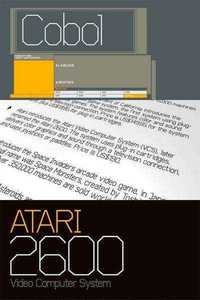
A modern geometric typeface evolved from a systematic grid. The consistency of form lends itself to a wide variety of applications and used at large scale creates a powerful impact. Also the characters have compact widths allowing for a great economy of space across layouts. Details include 4 weights, a complete character set, manually edited kerning and Euro symbol.
OTF | 4 Fonts | JPEG Preview | 4.2 Mb RAR
Read more