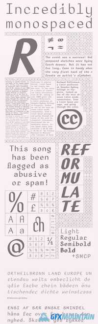
BC Reformulate Font Family
8 TTF
There aren’t many fonts on the market which naturally and functionally combine strict rationality with humanistic calligraphy inspirations. Reformulate proves that even a non-proportional font, created using a very simple principle of shadowing, need not appear cold, drab and artificial. Jakub Samek displays a good sense of balance between the traditional and the calculated, between banal and thought-out. For him, optical impression and an aspiration for perfect legibility are more important than the perfect consistency of individual characters, taking a free, but educated approach. A geometrical construction, wrapped in an Illustrator brush stroke, was placed onto a cone of uniform width, as dictated by the tools and the grid. In spite of its coarseness in both principles and implementation, Reformulate later found a somewhat surprising application for its use.