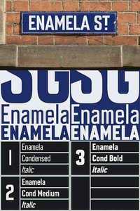
Enamela

6 OTF Fonts
ENAMELA (rhymes with Pamela) is based on condensed sans serif lettering found on vitreous enamel signage dating from the Victorian era and widely used in Britain for road signs, Post Office signs, the plates on James Ludlow wall postboxes, railway signs and direction signs, as well as for circular Automobile Association wayfinding plaques throughout the first half of the twentieth century. In addition to the Medium and Bold weights found on old enamel signs, a new Regular weight and the addition of a convincingly classic lowercase to match the original capitals, make Enamela Condensed a flexible and highly usable typeface. Each weight has a complementary and complimentary faux italic.
The roots of the lettering date back to Victorian times; a Cherry Blossom Boot Polish enamel advertising sign on the Advertising Antiques website is estimated to date from 1880. Between 1908 and 1915 the lettering was used on ‘bull’s eye’ station signs for the London Underground up to the introduction of Johnston’s Underground type. I initially saw a similarity to the Charles Wright car registration plate font (see K-Type Mandatory) with its quirky terminals stemming from the compression of geometric type. Alan Brignull noted the similarity to a Victorian wood type called Runic, though the terminals on C, G, J and S slope in the opposite direction. The precise origin and identity of the typeface continues to prove elusive. In search of an existing digital font, I sought the help of Luc Devroye in Montreal who identified the closest match as Czech designer František Storm’s Enamelplate D, similarly condensed with the correctly sloping terminals. However, many characters differ substantially from those in local source material, perhaps indicating that continental European enamel lettering varied from its British counterpart, though even in Britain a fair degree of variation can be observed, draughtsmen evidently feeling free to amend the basic letter shapes and exercise individual taste. The middle diagonals of an uppercase M usually extended down to the baseline, becoming rather heavy and congested, but some draughtsmen started following the Gill /Johnston example of a higher pointed vertex, and this more elegant option has been chosen for the new Enamela typeface, though the alternative M with lower vertex is also provided at the Alt-M (µ) keystroke on a Mac, or Alt-0181 on Windows. While some designers preferred a plain vertical throat on the G, others added a crosspiece to help distinguish it from a C, and the latter is the form chosen for the Enamela fonts. However, the G without the horizontal is also present, assigned Unicode FF27 (full width capital G).
nitroflare.com: Download
