Hand Sketch Rough Poster

OTF
CONCEPT/CHARACTERISTICS
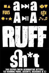
“Hand Sketch Rough Poster” is a handmade, rough and dirty sans-serif display font for decorative headline sizes. Hand drawn. A–Z (× 2), a–z (× 2) and 0–9 (x 4) are each many different forms. Contextual alternates. Is intended to show the hand-made character and the vibrancy of the display font. The different forms of roughness creates a liveliness in the typeface.
Standard ligatures like ae, oe, AE, OE, ff, fl, fi, fj, ffl, ffi, ffj and more decorative ligatures like CT, LC, LE, LH, LI, LO, LU, LY, TOO,TC, TE, TH, TU, TZ and ch, cl, ck, ct, sh, sk, st, sp, especially BPM, fff, ppp, sfz and many more … plus Versal Eszett (Capital Letter Double S) give the font more life and shows that despite their retro-looks works with modern OpenType technology (type the word note for the symbol ? and the word love for the dingbat ? … ). Symbols like play, stop, eject, forward, backward, skip, pause and so on. The topic for the discretionary ligatures and the symbols are music.
Have fun with this font – turn up the volume!
APPLICATION AREA
The ruff font would look good at headlines. Turn up the volume – set it big! Editorial Design (Magazine or Fanzine) or Webdesign (Headline Webfont for your website), party flyer, movie poster, music poster, music covers or webbanner …
TECHNICAL SPECIFICATIONS
Headline Font | Display Font | Sans-Serif In Your Face Font “Hand Sketch Rough Poster” OpenType Font (Mac + Win) with 560 glyphs (146 kerning pairs, contextual alternates via OpenType Feature, standard & discretionary ligatures, symbols, dingbats, accents & €).
nitroflare.com: Download
