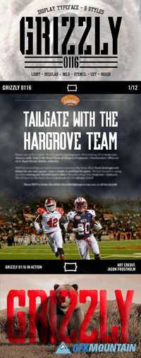
Grizzly 0116 Display

6 OTF
Light, Regular, & Bold - Based on the fact that you're here looking at typefaces, I can only assume that you have good taste and do not need the explanation of these styles.
Light, Regular, & Bold - Based on the fact that you're here looking at typefaces, I can only assume that you have good taste and do not need the explanation of these styles.
Stencil (Seen above) - This style breaks the mold of traditional stencil type by simplifying the points of the stencil break, instead of putting them in the center on each glyph.
Cut - This style is created to give a bevel feel to the typeface. If you're a fan on sports type, particularly in college branding, you're very familiar with this look. (check out the "Reese's Senior Bowl" example created by Jason Frostholm)
Rough - Simply put, it's Grizzly 0116 with rough edges. (check out the "Grizzly Bear" example created by Dylan Winters)
nitroflare.com: Download
