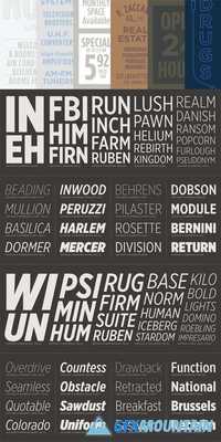
Gotham Extra Narrow

16 OTF
As a typeface's design approaches extreme proportions, its visual themes begin to take a back seat to spatial considerations. Condensed fonts will favor consistent spacing above all else, a priority which manifests itself in Gotham Condensed through the addition of new visual strategies. On letters like C and S, stroke endings that were once sheared perpendicularly will end vertically instead; joins in lowercase letters that once appeared monolinear become palpably thinned.On any continuum of font widths, there's a point at which designs cease to feel "natural" and begin to feel "condensed" instead. In the Gotham family, Gotham Extra Narrow is the last stop before that turning point. It shares all the characteristics of the wider Gothams, but is 20% narrower than Gotham Narrow (and 30% narrower than the regular width Gotham). Though well-suited to headlines and subheads, it shares with the wider Gothams a propensity for text sizes, and includes all the features required of a hard-working text face: a sound Book weight, tabular figures and fractions, and a healthy range of weights from Thin to Ultra, complete with italics throughout.
nitroflare.com: Download
