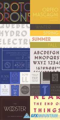
Landmark

4 OTF
The signature alphabet of one of New York’s most significant buildings becomes a family of clear and colorful display fonts.Bierut commissioned a new alphabet from Hoefler & Co. inspired by letters found on the building itself. The words “LEVER HOUSE” on the Park Avenue window had a spare and manifest geometry which was shared by the inscription on the building’s cornerstone, together shaping the direction of the Landmark typeface. Of vital importance was that the typeface succeed in all capitals, in keeping with the architectural aesthetic, and that it satisfy a range of applications and materials, from large-scale steel signs to ADA-compliant elevator panels cast in resin.In preparation for its release, Hoefler & Co. revisited the original Landmark typeface with additional variations in mind. Thinking about the material qualities of architectural lettering, and how it responds to changes in light and perspective, prompted three new designs: a keen Inline, a contemplative Shadow, and a dazzling Dimensional.
nitroflare.com: Download
