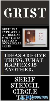
Grist

Grist
OTF
OTF
Grist was designed originally as a logo proposal for art-pop band Fischerspooner. It was one of a series of ideas exploring ways of taking an upper case serif font and making it ‘graphic’, so like a logo rather than a typeface. I tried this in various ways – by making the serifs thicker, or making the serif oversized and angular. These generally weren’t very successful. The most successful version stripped out the thin stress of the typeface and added a circle as an occasional serif. This made a dotting effect when set as multiple words. This was presented, to be rejected and a more neutral serif typeface used in what became a very untypographic series of record sleeves. Having written a blog post and reminding myself about the project, I wanted to develop this serif stencil circle typeface further. As it happened during the Fischerspooner project and in a fit of enthusiasm I had drawn a complete A-Z. What I liked about the idea originally was that the typeface was made up of these big, dramatic shapes, either the circle or bits of circle or these swashy triangles or rectangles. There were no small fussy shapes, so it could be cut out and used as a stencil. The serif was a useful connecting device and the letters were, generally, readable.
nitroflare.com: Download
