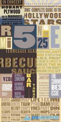
Champion Gothic

Champion Gothic
7 OTF
7 OTF
Originally developed for Sports Illustrated, the Champion Gothic series was created to help designers deal with headlines of different lengths. Rather than rewrite a headline that runs too long or too short — or worse, resort to the abominable practice of stretching the fonts — Champion users can step gently toward narrower or wider fonts, helping make the text fit, without alerting the reader.American woodtypes of the late nineteenth century served as the inspiration for Champion Gothic, in both form and philosophy. Before the modern idea of the rational type family, in which a central design is reshaped to make different weights and widths, woodtype makers produced typefaces “in series,” collecting visually related designs together under the same name. Unlike a type family, fonts produced in series usually had no central design, a practice that Champion follows. As a result, each of Champion’s six styles feels like the normal width.
nitroflare.com: Download
