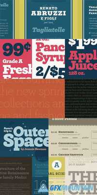
Archer Pro

Archer Pro
16 OTF
16 OTF
Archer, the colorful slab serif.Sweet but not saccharine, earnest but not grave, Archer is designed to hit just the right notes of forthrightness, credibility, and charm.The Geometric is a twentieth-century riposte to the Antique. Informed by the same kind of rationalist thinking that inspired the great sans serifs of the Bauhaus, Geometrics abandon traditional forms in favor of mathematical strategies. A Geometric’s O is circular rather than elliptical, and its forms shed their residual contrast between thicks and thins. Geometrics usually apply this same rationalism to the woollier parts of the alphabet, replacing the alphabet’s beaks and tails and ball terminals with a program of matching serifs. While these faces can sometimes be bracingly modern, they’re often monotonous, and many Geometrics suffer from an astringent sting that makes them difficult to use and unwelcome to read.
nitroflare.com: Download
