Requiem

Requiem
14 OTF
14 OTF
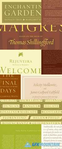
A true renaissance letter. Inspired by an illustration in a sixteenth-century writing manual, Requiem celebrates the fertile world of Renaissance humanism. The typefaces of the first generation after Gutenberg were all based on contemporary handwritten forms. But with the Renaissance came a renewed interest in the inscriptional lettering of the classical period, especially the capital letters that come to us directly from Roman monuments. Attempting to dissect these letters scientifically was a common pastime among the most prominent Renaissance minds: Fra Luca de Pacioli, remembered as the father of double-entry bookkeeping, took up the subject in De Divina Proportione (1497); publisher Geoffroy Tory offered a more mystical analysis in Champ Fleury (1529). One of the great treatises on the constructed alphabet was On the Just Shaping of Letters (1535), by no less than the old master Albrecht Durer. Approaching lettering from the perspective of practitioners were the writing masters, whose writing manuals taught the methods by which every form of lettering could be rendered. First among equals was Ludovico Vicentino degli Arrighi (1480-1527), a calligrapher at the Apostolic Chancery in Rome. His writing manual Il Modo de Temperare le Penne (1523) includes one of the most elegant renderings of the classical alphabet, letters which were freed from the shackles of geometry and simply shown floating in a solid field of black. These letters served as the basis for Requiem’s Display Roman and Small Caps. Missing from most of the renaissance writing manuals — including Arrighi’s — is a viable roman lowercase. The upright lowercase was more the province of typefounding than calligraphy, so the few writing masters who attempted a lowercase did so hesitatingly, often with gloomy results. (The lowercase in Giovanni Francesco Cresci’s 1570 Il Perfetto Scrittore is among the best, though even this is overly gothic.) Requiem’s lowercase is therefore an invention, as are its figures and punctuation, but for its italic it returns wholeheartedly to the full-blooded “chancery cursive” for which Arrighi is most famous. Finally, Requiem includes two sets of alphabets contained within decorative “cartouches,” whose endpieces are inspired by the work of Arrighi’s contemporaries Giovanni Battista Palatino and Vespasiano Amphiareo
nitroflare.com: Download
