Grecian Light Face

Grecian Light Face
2 OTF
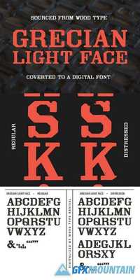
Grecian typefaces typically feel towering and rough-hewn, and are also quite frequently condensed. However, this Grecian is blessed with a wider stance, which might explain its friendlier tone. Yes Grecian Light Face may be old and rugged, but it also has the time to sit down and chat a while.
Light Face may be old and rugged, but it also has the time to sit down and chat a while.
Grecian Light Face was first shown as wood type under the name Light Face Grecian by David Knox & Co. in 1858. Knox appears to be the only manufacturer of this particular Grecian design.
The font includes two weights: regular and distressed. The regular weight is a clean, precise redraw which captures the contours of the original wood type. The distressed weight is a rendering of the textures of the letterpress proof itself, warts and all. The distressed weight features alternate characters with extra dings and blemishes, set as the lowercase keyboard characters.
nitroflare.com: Download
