Sanomat Sans Text Font Family
Sanomat Sans Text Font Family
14 TTF
14 TTF
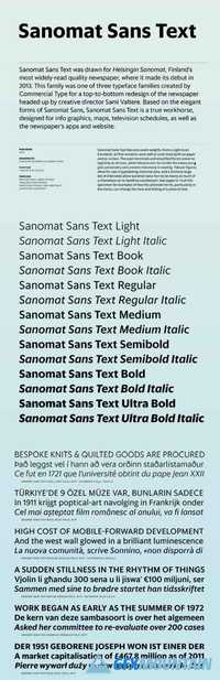
Sanomat Sans Text was drawn for Helsingin Sanomat, Finland’s most widely-read quality newspaper, where it made its debut in 2013. This family was one of three typeface families created by Commercial Type for a top-to-bottom redesign of the newspaper headed up by creative director Sami Valtere. Based on the elegant forms of Sanomat Sans, Sanomat Sans Text is a true workhorse, designed for info graphics, maps, television schedules, as well as the newspaper’s apps and website. Sanomat Sans Text features seven weights, from a Light to an Extrabold, all fine-tuned to work well at small sizes both on paper and on screen. The open terminals and simplified forms preserve legibility at all sizes, while idiosyncratic forms like the lowercase g give personality and prevent monotony in reading. Tabular figures allow for use in typesetting intensive data, and a large set of alternates allows Sanomat Sans Text to be nearly as much of a chameleon as its headline counterpart.
