Styrene Font Family
Styrene Font Family
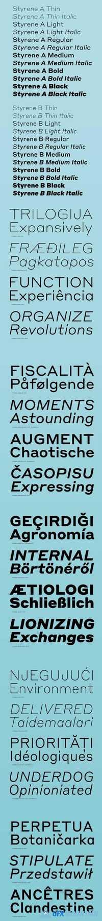
Styrene, a new sans serif by Berton Hasebe, is his latest exploration of proportion and simplicity in type design. The initial inspiration for the family was a charmingly awkward sans serif called Breede Schreeflooze shown in an early 20th century type specimen published by the Enschede Typefoundry in the Netherlands. However, Styrene has an ahistorical attitude. Its name was inspired by the purposefully synthetic feeling to its curves and geometry. Styrene is characterized by its proportions: typically narrow characters like f j r and t are hyperextended and flattened, adding openness in unexpected places. Styrene’s two widths offer different textures in text: version A is dogmatically geometric, with a stronger overall personality, while version B is narrower for more reasonable copyfit, though not truly condensed.
nitroflare.com: Download
