Genre Font Family
Genre Font Family
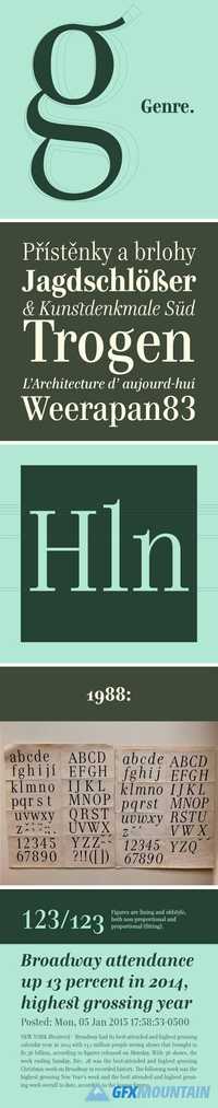
Genre is inspired by 19th century architecture, with serifs formed like facade ledges. Its nature is silent, stable and rational with distinctive fragile look. It’s been released in display cuts only, and the narrow proportions suggest its use for exhibition posters, magazine headlines and catalogues. This typeface is my juvenile schoolwork dated from 1988. The whole Regular set was drawn with ink on paper and photo-reproduced by magnifier in a darkroom. I used to set text lines on photographic paper for my early designs. Its naive concept and elaboration is obvious, but perhaps it may be found interesting. The official terseness and grey of Neo-Classical type faces will stand out when we narrow them. The consistently vertical shading of the letters suppresses one’s desire for eccentricity. Genre’s basic design is fairly light in colour, which is why it looks good in illustrated magazines and short texts and directly calls for graphically striking, contrasting headings.
nitroflare.com: Download
