Wildberry Display Fonts

Wildberry Display Fonts
2 TTF OTF 2 WOFF
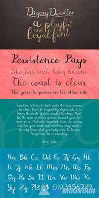
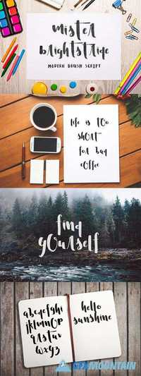
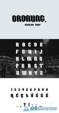
Cool handwritten font. Consists of 4 styles - Regular, Italic, Vintage, Vintage Italic. Perfectly suitable for the decoration of your works, design of logos, creation of invitations, greeting card and more.
2 TTF OTF 2 WOFF
Cool handwritten font. Consists of 4 styles - Regular, Italic, Vintage, Vintage Italic. Perfectly suitable for the decoration of your works, design of logos, creation of invitations, greeting card and more.


