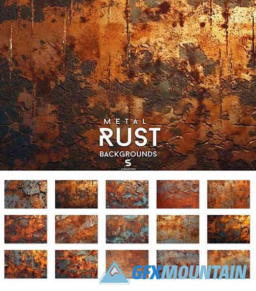
Rust Metal Backgrounds

PNG
Perfect for
Websites
scroll motion websites
PowerPoint
Prints , Web, Design
Presentations
Font presentation
Logotype
app design
Background textures are visual elements that add depth, interest, and character to a design or image. They are typically used as a backdrop or base layer to enhance the overall visual appeal of a project. These textures can range from simple patterns, such as grunge or geometric shapes, to more intricate designs inspired by nature or various materials.
Clients can utilize background textures in numerous ways to enhance their projects. Here are a few examples
Web Design: Background textures can be applied to websites, providing a visually appealing foundation that complements the content. They can be used behind text, images, or as full-page backgrounds to create a unique and engaging user experience.
Graphic Design: Background textures can be used in various graphic design projects, such as posters, brochures, and advertisements. By incorporating textures, designers can add visual interest, break up large areas of solid color, and create a more captivating and professional look.
Branding and Identity: Background textures can play a significant role in establishing a brand's visual identity. By selecting and consistently using specific textures across different brand assets like logos, business cards, and stationery, clients can create a cohesive and memorable brand presence.
Print Materials: Background textures can be applied to printed materials like invitations, packaging, or book covers. They can add a tactile and aesthetic quality to the design, enhancing the overall look and feel of the finished product. Presentations and Slides: Background textures can elevate slide decks and presentations, making them more visually appealing and engaging. By using subtle textures or overlays, clients can create a professional and polished look that enhances the content being presented.
When using background textures, it's important to consider the overall design aesthetic, readability, and the intended audience. The textures should complement the content without overpowering it, and they should be used judiciously to maintain visual balance and clarity.
