Financier Display Font Family
Financier Display Font Family

Financier Display Font Family

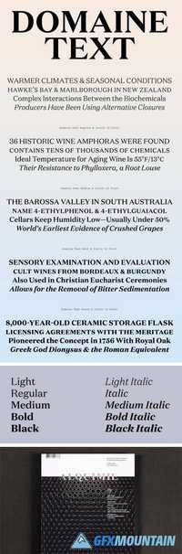
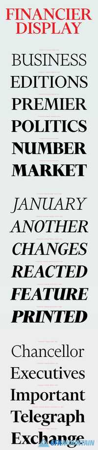
Financier is a new typeface family drawn for the redesign of the Financial Times (FT), which was launched in September 2014. It comprises two complementary sets of styles: Financier Display and Financier Text. Kevin Wilson and Mark Leeds provided design direction over the course of several months. The brief was to produce a sharper, more modern newspaper that shows off the FT’s strengths in reporting, analysis and visual journalism. The newspaper needed to be more than just a snapshot of the website at a particular point in the day, but an edited selection of the best the FT has to offer. It needed to complement FT.com and provide a competitive “finite” read of “what you need to know” each day.
Read more

Cry Wolf Font Family

Cry Wolf Font Family

Cry Wolf Font Family

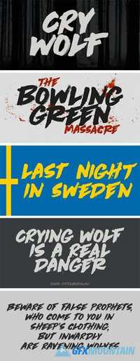
When I was a kid, I loved the story of The Boy Who Cried Wolf. I thought it was pretty stupid of the boy to trick the villagers into believing wolves are attacking his flock of sheep. But I also thought it was a bit sad that the sheep are eaten by a wolf in the end. I didn’t really feel sorry for the boy (he really was stupid), nor the wolf (he just does what he is supposed to do in life), but I did feel sorry for those poor sheep. I guess this is what disinformation leads to in the end. Cry Wolf is a bit of a scary font: it was made with a really old and battered brush, using Chinese ink and some quality French paper. It has a slight tilt to the right and I added some inky splatter for dramatic effect. Use Cry Wolf for your book covers, product packaging and headlines; use if to spice up you invitations and your halloween posters. Comes in a slightly tilted Regular style and an outright Italic style.
Read more

Boing Font Family

Boing Font Family

Boing Font Family

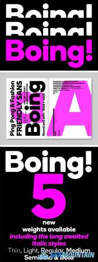
Boing is a bold, rounded sans serif font ideal for a range of communication needs. The face is soft, yet solid, determined, yet friendly. Boing has been designed as a display face, but it also works equally well in running text.
Read more

GT Pressura Font Family

GT Pressura Font Family

GT Pressura Font Family

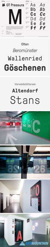
GT Pressura is inspired by metal type printing history as well as engineered letters stamped onto shipping boxes. It uses the visual gesture of ink spreading under pressure as a stylistic device, offering an alternative to more spindly typefaces of the digital age.
Read more

Filter CF V.2 Font Family

Filter CF V.2 Font Family

Filter CF V.2 Font Family

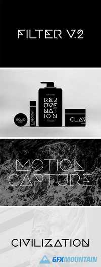
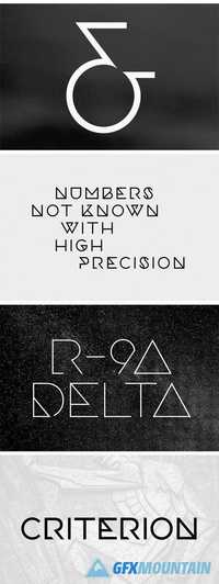
Fusing constructivism, fashion, and design, FILTER CF is an experimental display typeface in five weights. Excellent for short bursts of stylized text, Filter features Latin and Cyrillic alphabets with nods to art deco, geometry, and science fiction. Version 2 adds new glyphs, new weights, refined and redrawn letters, kerning improvements, and more.
Read more

PMN Caecilia Font Family

PMN Caecilia Font Family

PMN Caecilia Font Family
8 OTF
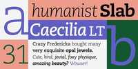
This Linotype typeface was designed in 1990 by Peter Matthias Noordzij (PMN), and named for his wife, Caecilia. Because its shapes are humanist rather than geometric, PMN Caecilia is easier on the reader’s eye and so more useful as a text typeface than most slab serif designs.
Read more

Xova Font Family

Xova Font Family

Xova Font Family

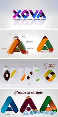
XOVA base, color one, color two, color three and color four, is an 5 font system that can be layered in different ways to create a infinite title effects used commonly in poster and 3D logo design. Steel Chisel’s layer combinations give you complete control in producing styles like, modern, 3D, beveled. It can be used alone and/or in layered and allows you adjust leading and kerning. Each font contains the similar metrics, so when your title is set, copy and paste-in-place to create layers of different weights/styles to build out your desired effect. Xova works great in any graphics application that allows you to utilize layers or 3D effects.
Read more

Reader Font Family

Reader Font Family

Reader Font Family

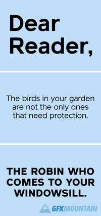
Reader is a neo–grotesque typeface initially created in a medium weight, and now re-cut into a base family of six weights with an additional seventh in the form of Reader Black. The typeface itself has been referenced from an RSPB letter dating 1972. The original typeface, which is unknown, was a monospaced, rounded face. It had geometric proportions which felt like they wanted to break free of the restrictions of a monospaced grid. The construction and geometric properties from this type were taken into the sketching process of Reader but without the monospaced grid. The proportions of the typeface were rebalanced to give it a neo-grotesque, 1960’s swiss style feel, but also referencing the symmetry and geometry of the bauhaus. Weight has also been added to the face, giving a subtle stress to the characters and allowing easy readability. The ends of every stem, originally rounded, have been cut off, replaced with horizontal and angled edges to allow for evenly spaced typesetting. The name takes itself from the original reference of whom the letter is addressed to – Reader.
Read more