Artegra Slab Font Family 1818166
Artegra Slab Font Family 1818166

Artegra Slab Font Family 1818166
54 OTF 54 TTF
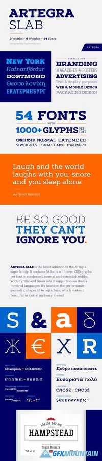
Artegra Slab is the latest addition to the Artegra superfamily. It contains 54 fonts with over 1000 glyphs per font in condensed, normal and extended widths. With Cyrillic and Greek sets it supports more than a hundred languages. It’s based on the perfectionist geometric shapes of Artegra Sans, which makes it beautiful to look at and easy to read.
Read more

National Font Family

National Font Family

National Font Family

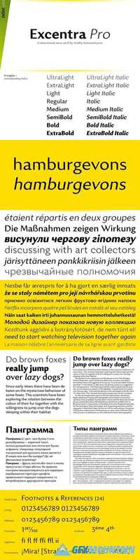
National is a deceptively simple sans serif with subtle details that give it a distinctive—but not distracting—personality. While National travels through, and touches on, a lot of historical material, it is designed to thrive in our modern typographic climate. National’s details are drawn from the best pre-Akzidenz grotesques, giving it a humble, workmanlike character with an agreeable tone of voice. Its extensive character set includes a wide array of accents, seven numeral sets, alternate forms for some base glyphs, and small caps across all styles. In short, all the good things that the exacting typographer should expect from a contemporary OpenType typeface.
Read more

Merlo Neue Round Font Family

Merlo Neue Round Font Family

Merlo Neue Round Font Family

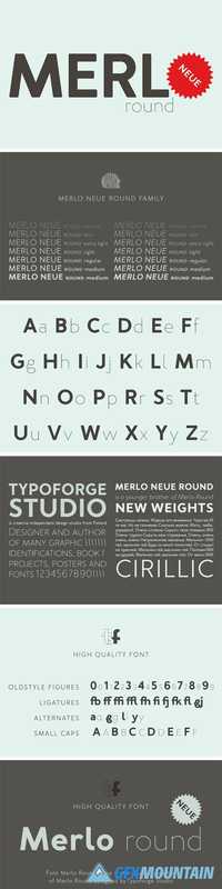
Merlo Neue Round is the younger brother of Merlo Round and cousin of Merlo Neue. New family received refreshed, rounded style and a new shape of many glyphs. New Merlo consist of a wide range of instances – seven new weights with italics, from Hairline to Bold allows to use the family in a complex way, depending on the user’s needs. Font has a glyph set for latin and cyrylic script, small caps and old-style figures. Merlo Neue Round would be a great choice for display use as well as for the longer texts. Family is inspired by a “You And Me Monthly” published by National Magazines Publisher RSW "Prasa” from May 1960 till December 1973 in Poland.
Read more

Calibre Font Family

Calibre Font Family

Calibre Font Family

Metric & Calibre are a pair of typefaces that share a fundamental geometry yet differ in the finish of key letterforms. Metric is a geometric humanist, sired by West Berlin street signs. Calibre is a geometric neo-grotesque, inspired by the rationality of Aldo Novarese’s seldom seen Recta. They were conceived as a pair but function independently of each other. The development of Metric & Calibre is based upon two ideas—1: “engineered geometry” and its application to street signage, 2: alternate letterforms in typefaces.
Read more

Pixie Family Bundle 1309682

Pixie Family Bundle 1309682

Pixie Family Bundle 1309682

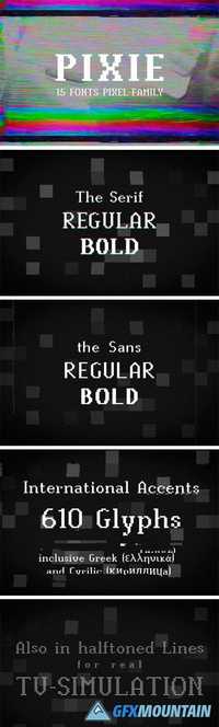
Pixie is a modern pixel font family with 610 glyphs including 15 font styles. Pixel = only 8Bit Games? No! This font suits also well to movie-titles, tech-logos, party-visuals, website-scripts and so on. Works great in small and big sizes.
Read more

Proprietor Font Family - 7 Fonts

Proprietor Font Family - 7 Fonts

Proprietor Font Family - 7 Fonts
TTF

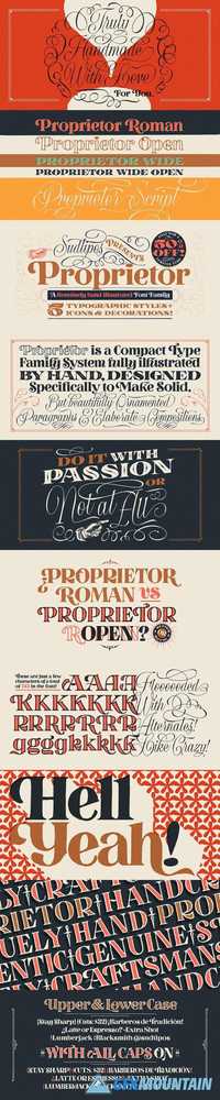
The great value of something crafted thoroughly by hand has been observed for years by Guille Vizzari throughout a wide spectrum of clients and projects developed at «Yani & Guille» —the studio he runs cheek by jowl with Yani Arabena—, and they both noticed that recently it has been taking on a new meaning. From barbers at their shops, to a barista that passionately prepares coffee every morning, or a bartender that deeply enjoys diving towards unknown ingredients, and even Guille’s admiration for sign painters worldwide that keep spreading their passion for the perfectly constructed letter.
This wide trades universe, where craftsmanship represents a huge difference, is where «Proprietor» lives, and it’s the reason why it exists.
Read more

Register Font Family

Register Font Family

Register Font Family

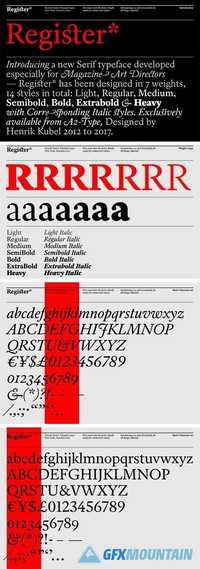
Inspired by French Renaissance era type and traditional broad-nib calligraphy Register* is a family of versatile serif typefaces crafted with today's designer & editorial art director in mind. Background: The typeface launched exclusively, as a proprietary face for A2/SW/HK's award winning redesign of the premier photography magazine, Aperture in spring 2013. Selected styles, and variations thereof, have since been customised for ‘Art Quarterly’ magazine, ‘The Sunday Times Magazine’ (UK) and became a reference point for A2-TYPE’s award winning Independent newspaper fonts.
Read more

Konstanz - Vintage Type Family 1768302

Konstanz - Vintage Type Family 1768302

Konstanz - Vintage Type Family 1768302

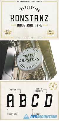
A bold, industrial type family paying homage to vintage signage and boutique design. As you can see the examples shown in the images, Konstanz lends itself perfectly for signage on multiple different levels. Konstanz comes in both Clean & Rough versions, and features a slanted oblique for both of these versions. Lowercase alternates - There are alternate characters for the letters A, D, E, K & O, as can be seen in the first image. These can be accessed by using the lowercase character. OTF/TTF - Konstanz comes in both OTF & TTF formats, for a total of eight font files for you to use as you see fit.
Read more